Angular – Use Tiles to implement a Holy-Grail layout

240825-30
Implement step-by-step your blog with a holy-grail layout using Angular Material mat-grid-list tiles!
Intro
This post aims to motivate you to start implementing a blog site by using the Angular arsenal.
The main topics that we will cover are:
- Implementing a pure HTML holy-grail layout
- Using the CSS Grid
- Using the CSS Flexbox
- Using @media queries
- Starting an Angular project consisting of the following 6 components:
- FooterComponent, HeaderComponent, LeftpaneComponent, MainComponent, NavrowComponent, RightpaneComponent
- Starting using mat-grid-list with mat-grid-tiles
- Dividing virtually the viewport width into columns and the full height into rows
- Using an array for mat-grid-tiles
- Adding real responsiveness using Material CDK BreakpointObserver.
- Making our components Dynamic components using the built-in ng-container Angular element, and by also using a helping directive. Using also the new exciting feature of Angular, the signals, for getting/passing input into the helping directive
- Materializing our holy-grail components using Material packages/modules that give our dynamic components a Material look and feel.
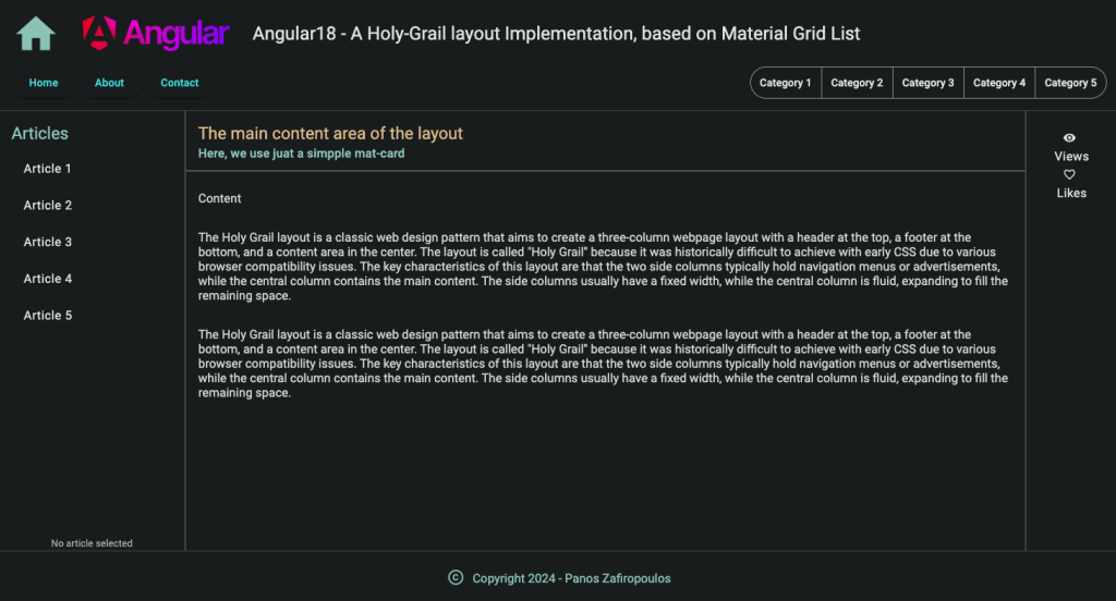
And this is the expected final output:
The HTML holy-grail basics
The holy grail is a well-known web page layout widely used in web apps. The key design concept is to have an area in our web page between header and footer that shares some equal-height columns, usually 3 columns: left, main, and right. Of course, the simplest implementations are based on plain HTML together with CSS (style sheets).
The basics There is no strictly defined holy grail layout, but the most used implementations include the following areas (the right pane/sidebar being missed many times):
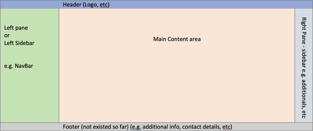
However, our ‘wishing’ page layout also includes a ‘sub-header’ navigation section:
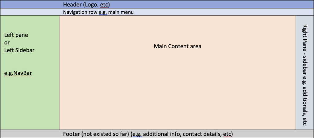
So, the main 6 areas (items) of our holy-grail layout are:
- header
- navigation row
- left pane – sidebar
- main
- right pane – sidebar
- footer
It is supposed that there is enough familiarity with HTML, but I want to make some notes just for recap.
The basic areas of an HTML page are:
HTML
head
body
or
<!DOCTYPE html>

<html>

    <head>
    </head>

    <body>
    </body>

</html>
All the holy-grail items should be contained inside the html body area. So, don’t confuse the html head with our header item. Moreover, if you wish to use css embedded in the html code, this should be done inside the html head area, using the html <style></style> tag.
It would be something similar to:
The tags used here, i.e.: <header>, <nav>, <aside>, <main>, and <footer> are all valid html container elements/tags. Of course we can define and use our very own classes or even custom html tags, but for this article, we will stick on them.
Moreover, consider that there are other html built-in tags that can be also used instead, e.g. for the left and right panes, here we use the <aside> tag, but one can also use other approaches such as <section> etc.
See here: https://www.w3schools.com/TAGS/tag_comment.asp
After these initial HTML notes we will see how we can use CSS Grid and CSS Flexbox and implement our goal.
Using the CSS Grid
Below, you can see an initial approach
As you can see above the 6 areas of the Body, defined by the corresponding tags, are styled by 4 CSS Grid template areas and each area consists of 3 columns. Then, for each area and each column, we assign heights (grid-template rows) and widths (grid-template-columns).
A better approach is to add some responsiveness using @media queries:
Now, let’s see how we can have almost the same result using the CSS Flexbox
Using the CSS Flexbox
The Initial Approach
To use the CSS Flexbox, the most appropriate approach (it is commonly used) seems to be the definition and usage of a middle area for dealing with the areas between nav and footer areas. In Flexbox terms this will be a flex row. For this purpose, we can define a container class that will include at least the 3 ‘middle’ areas: the left pane (aside left), the main, and the right pane (aside right). This container class will be applied in a div element in html code.
Responsive version using @media queries
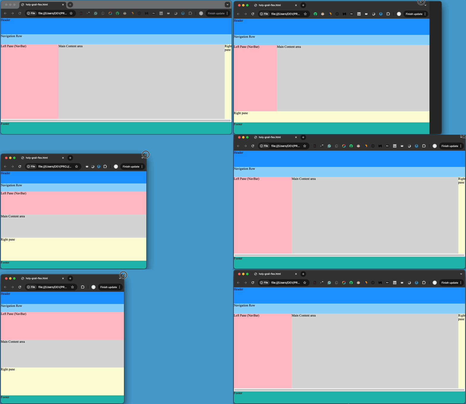
The ’middle area’ approach facilitates also the implementation of the responsive version.
As you can see the Flexbox implementation code is a bit cumbersome, but one can always use her/his very own approaches for the implementation. I.e. some more tiny adjustments (mainly in height values) may be necessary when we try to make the output of both Grid and Flex implementations look close enough to each other.
You can see the pure HTML output, below:
Find the final repo here.
The Angular project
Now let’s start our Angular example implementation.
You can create a new Angular project from scratch, and add 6 components – one for each of the areas we have seen above. You can do this on your own, but you can also use this repo here, which is based on CSS Flex and on a (relatively) recent version: Angular 18.1. 0. Then you must install Angular Material on your own.
The initial repo – CSS Grid with the components
However, here we are going to use this repo here, which is CSS Grid based, and the Angular Material 18.1.2 has been already installed. (Since we are going to use Angular Material Grid List and Tiles (mat-grid-tiles), CSS Grid or CSS Flex is not that important).
The following 6 components have been already created:
- FooterComponent
- HeaderComponent
- LeftpaneComponent
- MainComponent
- NavrowComponent
- RightpaneComponent
And the result looks like the one below:
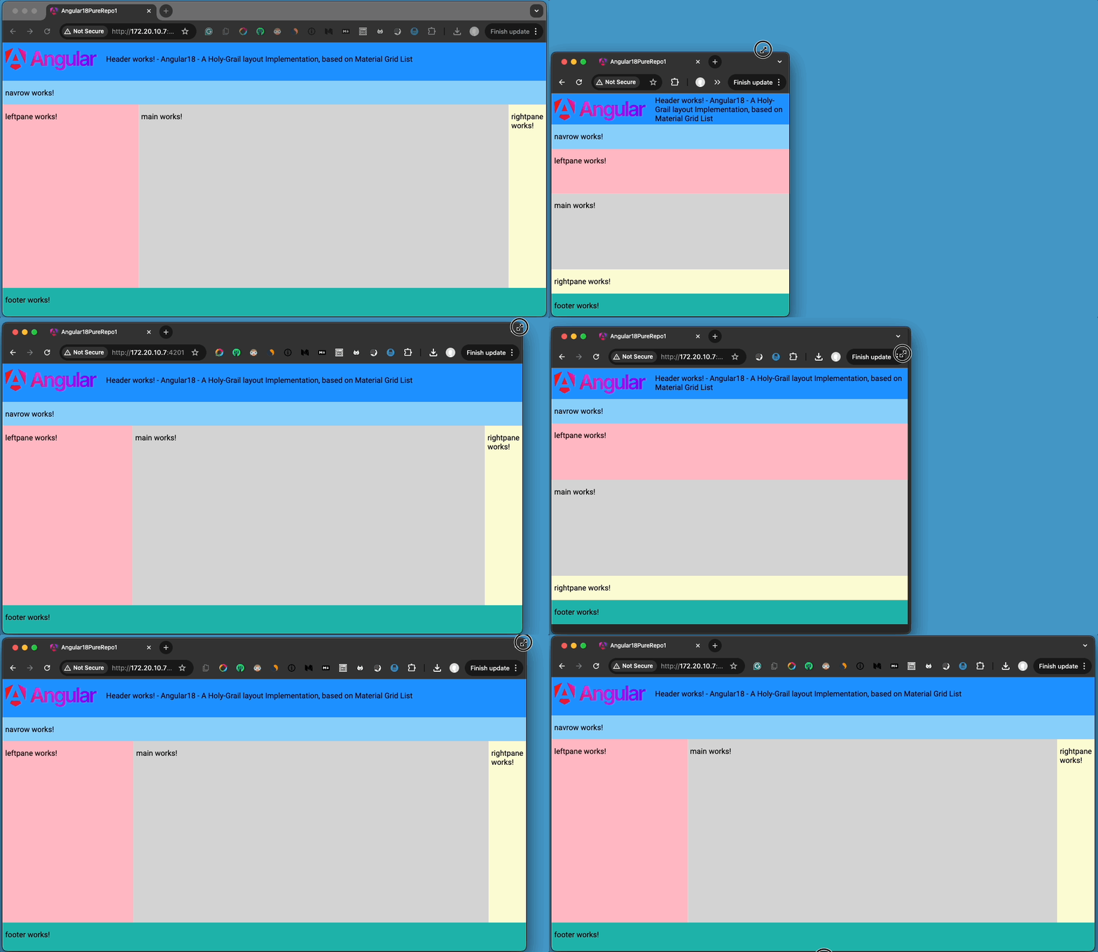
It is pretty similar to the previous one, isn’t it?
The main points here are:
a. We have moved the layout logic and the responsiveness, into the bootstrap component of our application, the AppComponent (see it in the main.ts).
In each of the main HTML Body areas, we have placed the respective component. So the app.component.html template became:
b. The style rules defined in the app.component.scss are similar to those we have previously seen in the pure HTML example:
c. However, a point here is that we have used CSS variables for grid areas’ height of rows and width of columns. The CSS variables are defined in the AppComponent class:
As you can see, we’ve used an Object consisting of several properties, for the heights and the widths of the grid area columns and rows, for the different viewport sizes defined in the stylesheet (in @media queries). For each height or width value, we also define the measurement unit to be used.
Finally, we have defined a get function that responds to each property (variable) request. The response is a string with the appropriate value-unit pair, delimited by a semi-colon; that replaces the corresponding variable in the stylesheet.
Apart from the HeaderComponent, all the other components remain as they have been created. However, in the HeaderComponent the wikimedia Angular logo has been used, as well as an indicative header title for our app.
Probably you find the definition and usage of CSS variables quite complex, but perhaps it was a good chance, just to be familiar with this option. In any case, we will not continue using them in the next steps.
The first implementation: mat-grid-list with mat-grid-tiles
First, import the MatGridListModule from ‘@angular/material/grid-list’ and then append it in the imports section of the AppComponent. The updated app.component.ts becomes:
Note that if you want to dig deeper into mat-grid-list and mat-grid-tiles, you can access the official documentation here.
Now remove everything from the app.component.scss and replace the code inside the app.component.html with the following code:
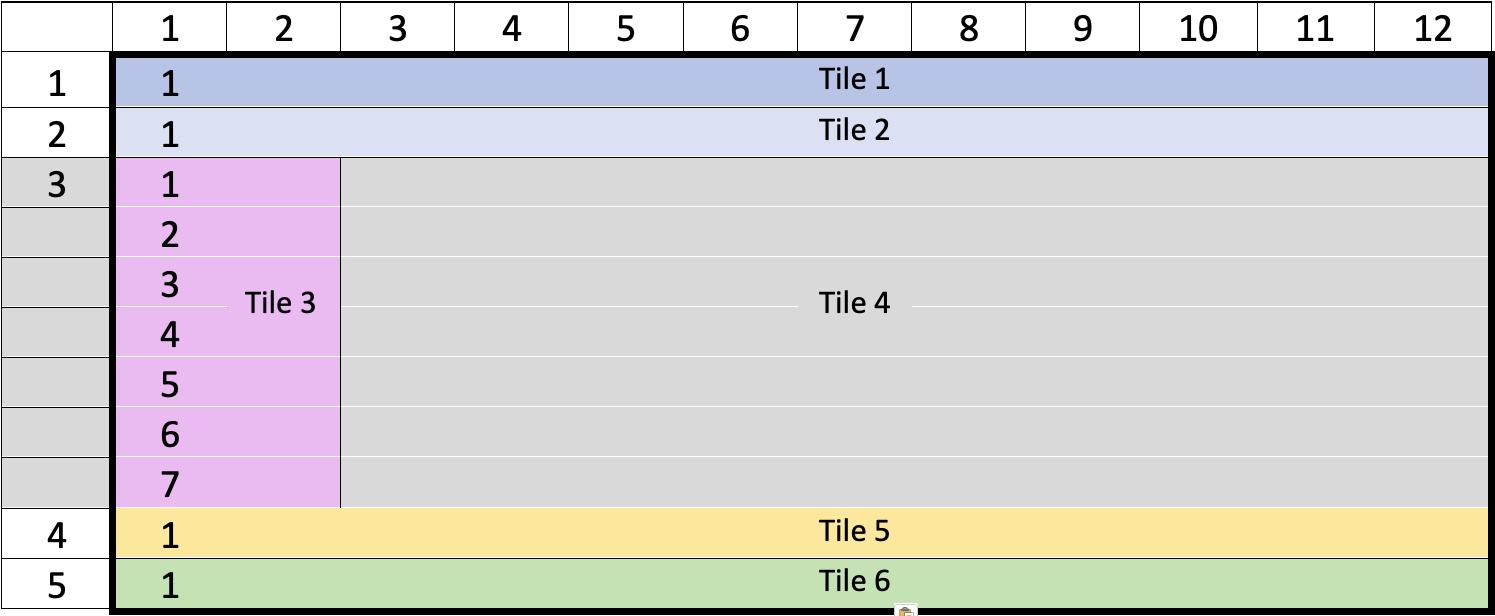
As you can see, we use 6 mat-grid-tiles, one for each holy-grail area. Virtually, we divide the width of the whole viewport into columns and the full height into rows. Actually, the viewport height is virtually divided into 4 horizontal areas: Header, Navrow, a ‘middle area’, and the Footer. The following schema might be useful for understanding our thinking:
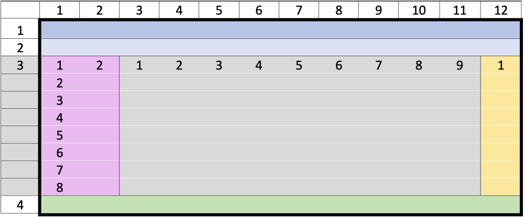
The more columns we divide the width of the viewport, the more flexibility and precision we get. A good working approach is to divide it into 12 columns. Then, we assign the desired columns for each tile. The Header, the Navrow, and the Footer components occupy the full width of the viewport, so we assign all 12 columns to each one of them (colspan=12). The ‘middle area’ is shared by the 3 components Leftpane, Main, and Rightpane, and we have assigned the values of the colspan as: 2,8, and 1 respectively.
Of course, we have also defined the heights of each virtual horizontal area. The key point here is that we have used the vh as a unit for the height of each row. Note that 1 vh equals to 1% of the full height of the viewport. Assigning a value to rowHeight around 9vh, in conjunction with the values assigned to the rowspan of each horizontal area, results in good initial responsiveness to our layout.
That’s it! You have your 1st mat-grid-list holy-grail layout! See the result below:
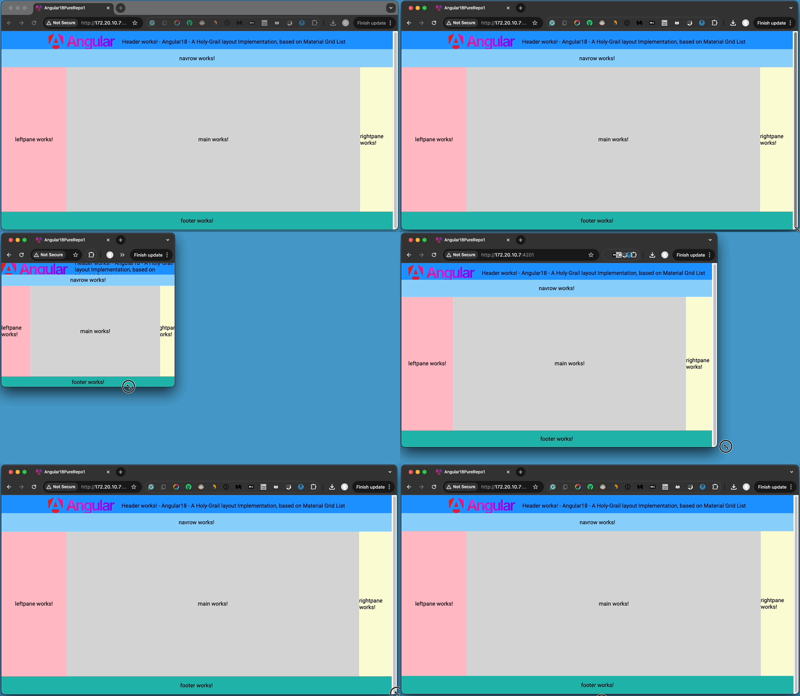
Note, that the mat-grid list offers some responsiveness and that -by default- the content inside the tiles- is justified in the center.
Find the updated repo here.
Use an array for mat-grid-tiles
Let’s put aside -for a while- our real components and let’s get a taste, of how we can use an array of objects to pass the tiles’ properties dynamically. We will still use the 6 tiles for the components already defined, as Tile 1, Tile 2, … Tile 6. For our purpose, we can define an Interface of the necessary properties of each Tile, e.g.:
 export interface Tile {
  cols: number;
  rows: number;
  text: string;
  color: string;
}
Then we can define an array of 6 Tiles, and assign values to their properties. That said, the Typescript code of our AppComponent becomes:
This is a good approach, and saves us from some boilerplate code.. The result is pretty much the same:
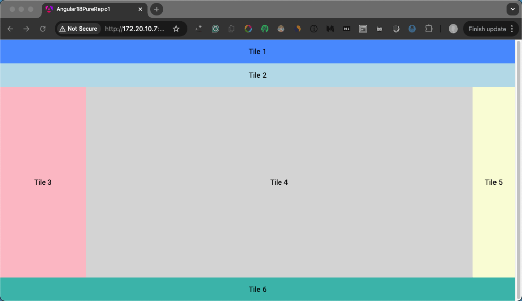
You can find the updated repo here.
Now it’s time to make our layout more responsive.
Adding real responsiveness using Material CDK BreakpointObserver.
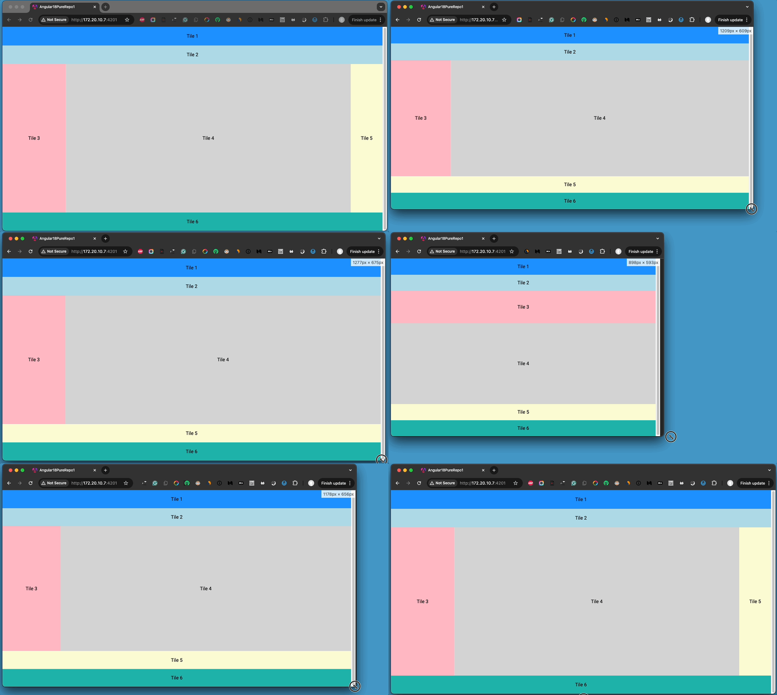
As we’ve seen the mat-grid-list with mat-grd-tiles, offers some responsiveness, but most of the time this is not enough. Actually, for smaller viewport sizes, it is preferred to be able to change the layout dynamically, e.g., the Tile 5, to be horizontally placed, instead of vertically:
For medium widths, the row areas become 5:
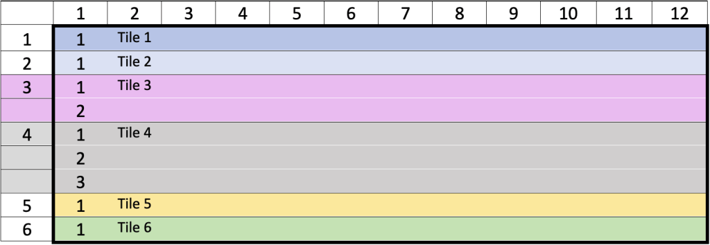
For even smaller widths we can change the layout in the viewport, spread in 6 row areas like this:
Good for us, the Material arsenal offers the appropriate tool, and this is the BreakpointObserver of the Layout package of the Material Component Dev Kit – CDK. You can find the required information and example snippets on the pages of the above official links.
Thus, we can import into our AppComponent, the necessary modules, and then define more Tile arrays -instead of 1, one for every viewport breakpoint we wish. Breakpoints offer us the necessary constants. Below is the full list of viewport sizes that you can use for your own needs.
- Handset
- HandsetLandscape
- HandsetPortrait
- Large
- Medium
- Small
- Tablet
- TabletLandscape
- TabletPortrait
- Web
- WebLandscape
- WebPortrait
- XLarge
- XSmall
For our example case, we can define 3 arrays, for giving each Tile, the property values for Large, Medium, and XSmall viewport sizes. Then, whenever the BreakpointObserver senses a change to the viewport size, we can use a method, e.g.: the getTiles() method, and obtain the appropriate array of tiles.
The updated code example of the app.component.ts becomes:
The template (app.component.html) remains almost the same (with just a small correction to avoid a Warning). The result is given below:
Find the updated repo here.
Make our components Dynamic components within mat-grid-list tiles
Now, it’s time to see a bit more advanced step. We are going to use the components that we created before, as Dynamic components – they will be dynamically loaded at running time. Before proceeding, recall that our created components are:
HeaderComponent, NavrowComponent, LeftpaneComponent, MainComponent, RightpaneComponent, and FooterComponent.
We will use our AppComponent as the host component for the other, dynamic components that are participating as layout components. HeaderComponent in the Tile 1 area, NavrowComponent in the Tile 2 area, and so on.
For our purpose, we can elaborate the template using some if…then logic, but it isn’t a good approach. Another solution is, to use them as dynamic components.
Note, that if you are not familiar with Angular dynamic components, is worth to gain some grasp, by taking a look at my blog post below:
Generally, we can easily apply any component dynamically, in any place in the template of a host component, by using the built-in ng-container Angular element, and by also using a helping directive. Moreover, here, we will also use the new exciting feature of Angular, the signals.
The helping directive
You can create a directive by using the following ng command:
ng g d add-comp-dyn --skip-tests=trueOur helping directive (AddCompDynDirective) we have just created, will be responsible for picking up and creating the appropriate component. For this purpose, it should be informed about that. Since we will use this directive inside the template of our host component (AppComponent), the host component becomes its parent component, and thus it can pass to the directive the necessary information, which in our case can be just a simple text/string token. Then, inside the directive, we can use the Angular Signal inputs, and use an input signal to obtain this token. Furthermore, we can constantly monitor for any changes to the input signal inside the effect() block in the directive’s constructor. Then in any change of the value of the signal (change of the token passed-in), we can pick up the appropriate component and dynamically create it, which results in its rendering inside the ng-container of the host component.
The component to be created is selected as the corresponding value of the same property as the token passed in, from the object ‘DynLayOutComponents’ which is defined inside the host component and exported, (as we will see a bit later). Finally, the real job, i.e.: the dynamic component creation, is done, by the ViewContenairRef container view.
Below you can see a working code example of our helping add-comp-dyn.directive.ts directive.
The host component (AppComponent) should be aware of (and it already is) the components and their matching areas in the layout. So, inside the host template, we iterate through the tiles, we can use the ng-container element with our helping directive and apply the matching dynamic component. For this, as we have said, we must inform the directive which is the corresponding dynamic component (in every iteration). We can do this, by using the tile ‘text’ property of the tiles array, as a text token to be passed in the directive, instead of the Area names we used previously.
The updated app.component.ts:
Note, that as we’ve said before, we have also defined the object ‘DynLayOutComponents’ as having as properties the tokens and values of the components that correspond to layout areas.
The updated app.component.html
Now if you run the app, you will see no difference to the output layout and responsiveness, but the fact is that all of our components are now loaded as dynamic components, and this is a real step ahead in the flexibility and maintainability of our app.
Find the updated repo here.
The next step is to “materialize” our components.
Materializing our holy-grail components
So, far we have actually left untouched our components, apart from the HeaderComponent, where we have used just an Angular logo image and a title. Our intention is to use some Material provided packages/modules, so our dynamic components get a Material look and feel.
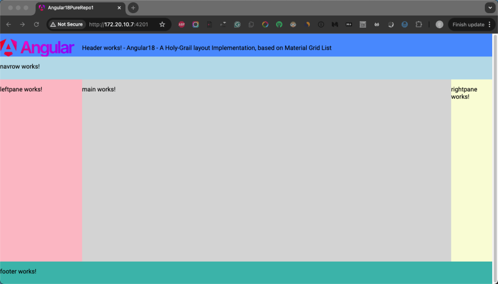
You probably remember that we have noticed the fact that the mat-grid-tile aligns and justifies the contained items at the center, -by default. Let’s first try to change this. A working solution can be provided in the host-AppComponent. The trick is to surround the <ng-cotainer> tags (the content of the dynamic component) with simple <span> tags and assign also a simple style class to that span. The style class is enough to just define full height and full width (100%). This is how you can do this:
The updated app.component.html
Now we can update the app.component.scss, by removing all old-style rules, and setting just the class rule used in the app.component.html above:
Note, that it is not recommended to add other styles to the .tile-container style class to avoid conflicts with the component’s own stylesheet and lose the desired result.
The result is as it is expected:
Now, let’s start with the HeaderComponent. For it. we will use the MatToolbarModule, the MatButtonModule, and the MatIconModule. Below is the example code for the HeaderComponent.
Note, that we have also elaborated the HeaderComponent, and we have played a bit with the stylesheet @media queries to achieve some responsiveness, which of course you can put more effort into your needs.
The result for the Header is similar to the one below:

Next, we continue “materializing” the rest 5 of our components. However, I am not going to present the code for each component class, template, and stylesheet, since you can take your time and examine the example code in the project’s GitHub repository. But, for a quick look, below are the rest of our components and the Material modules we have used in each one of them:
- NavrowComponent: MatToolbarModule, MatIconModule, MatButtonModule, MatButtonToggleModule
- LeftpaneComponent: MatCardModule, MatListModule, MatDividerModule
- MainComponent: MatCardModule, MatDividerModule
- RightpaneComponent: MatCardModule, MatListModule, MatIconModule
- FooterComponent: MatToolbarModule, MatIconModule
The point here is to see an example of how one can use the Holy-Grail layout to organize a blog site for her/his Articles (Posts) that are spread into Categories. So, the NanrowComponent uses 2 areas of menus, whereas the 2nd menu uses mat-toggle-buttons, to select a Category (of Articles). The Articles can be from a list (a set of mat-list items) in the LeftpaneComponent. The MainComponent uses a mat-card to show the Article content. The RightpaneComponent can be used for some additional info about the Article, e.g. for views, likes, etc.
You can see the final result below:
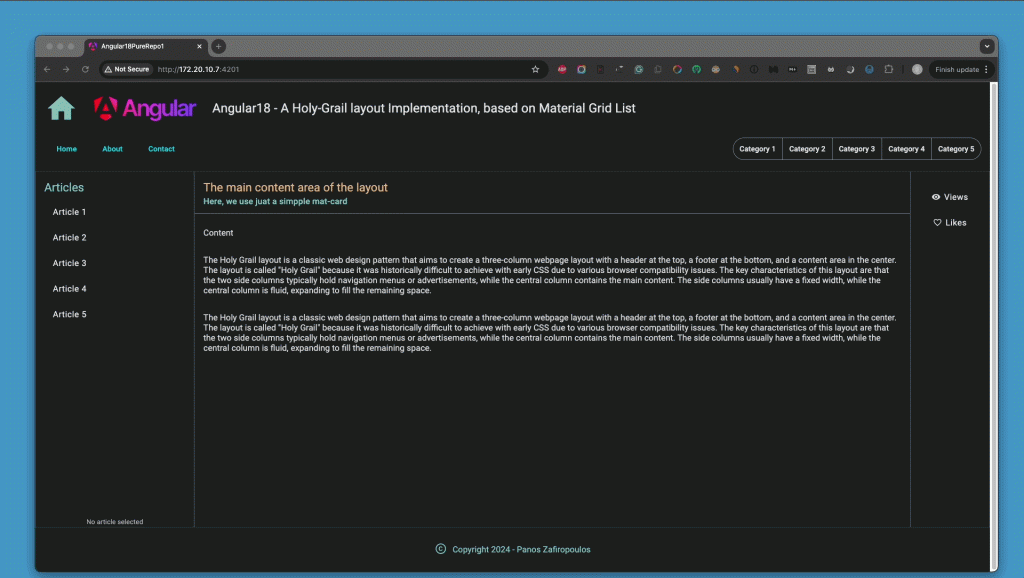
Note, that I have added some static example content, some mock Category and Article titles, etc., to give you a first taste, and motivate you to start building your own blog site.
Find the final repo here.
Conclusions
As you have seen, building a Holy-Grail layout for an Angular blog site involves a blend of foundational web development concepts and Angular-specific techniques. We have started from the basics of HTML’s Holy-Grail layout and then we have seen how we can use CSS Grid and CSS Flexbox, Using @media queries further enhances the site’s adaptability across different screen sizes.
In the Angular project, we utilized six key components—FooterComponent, HeaderComponent, LeftpaneComponent, MainComponent, NavrowComponent, and RightpaneComponent—to structure the site effectively. We introduced Angular Material’s mat-grid-list and mat-grid-tiles to efficiently manage the layout, dividing the viewport into a well-organized grid.
Moreover, by leveraging Angular’s Material CDK BreakpointObserver, we added real responsiveness, ensuring our layout dynamically adjusts to various screen sizes. The use of dynamic components, facilitated by Angular’s ng-container and a custom directive, along with the powerful new feature of signals, allowed us to make the components highly adaptable and interactive.
Finally, by integrating Angular Material packages and modules, we gave our Holy-Grail components a polished, Material look and feel.
So, that’s it for now. Thank you for reading!
Stay tuned, because in the following posts, we will see how we will go further and continue building an Angular blog site.

