Angular Material DateTimePicker(s) challenges
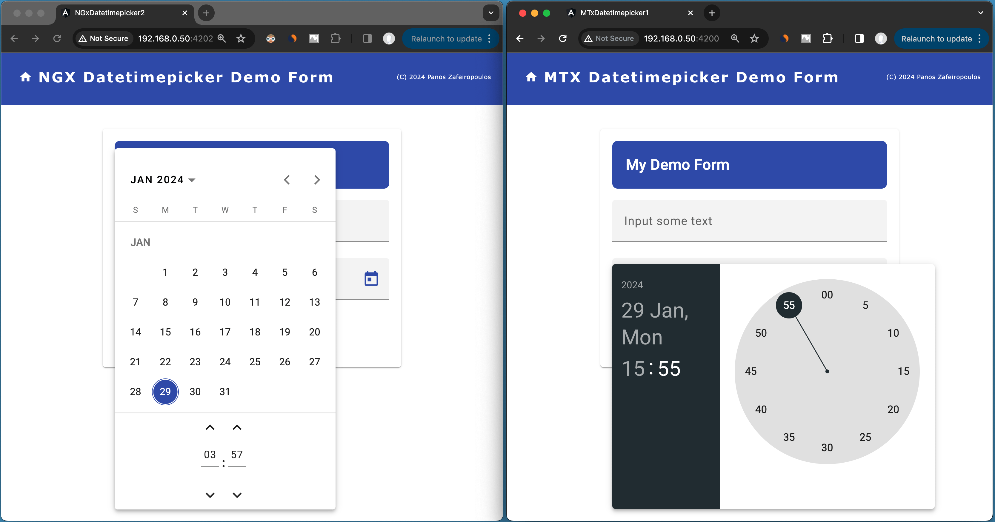
240129
Intro
Angular Material is one of the most extensively used UI component libraries for creating modern, responsive, and visually appealing web apps with Angular, that is developed and maintained by Google’s Angular team.
The library offers a wide range of components, including buttons, forms, navigation elements, date-calendar, dialog boxes, and more, all crafted with attention to detail and adherence to Material Design principles. However, anyone who has already started using it, is probably aware, that the library provides -of course- a Datepicker component, but lacks a built-in Date-and-Time picker component. (Note that the standard HTML form input type=datetime-local does a similar job).
In this post, I am sharing some of the challenges I faced trying to implement 2 of the most widely used 3rd party alternatives. Those challenges include theming, date parsing, and issues with the Moment.js dependency. So, if you have started dealing with the same subject then this post is for you.
Alternatives
The alternatives I tried out are:
- 1. the DatetimePicker of the @angular-material-components
- 2. the Datetimepicker of the @ng-matero/extensions
The base/starting project
As a base project for playing a bit with the Date Time Pickers, as we will see below, I have created this GitHub repo, which is nothing but a very elementary form consisting of just 1 input field and 1 button.
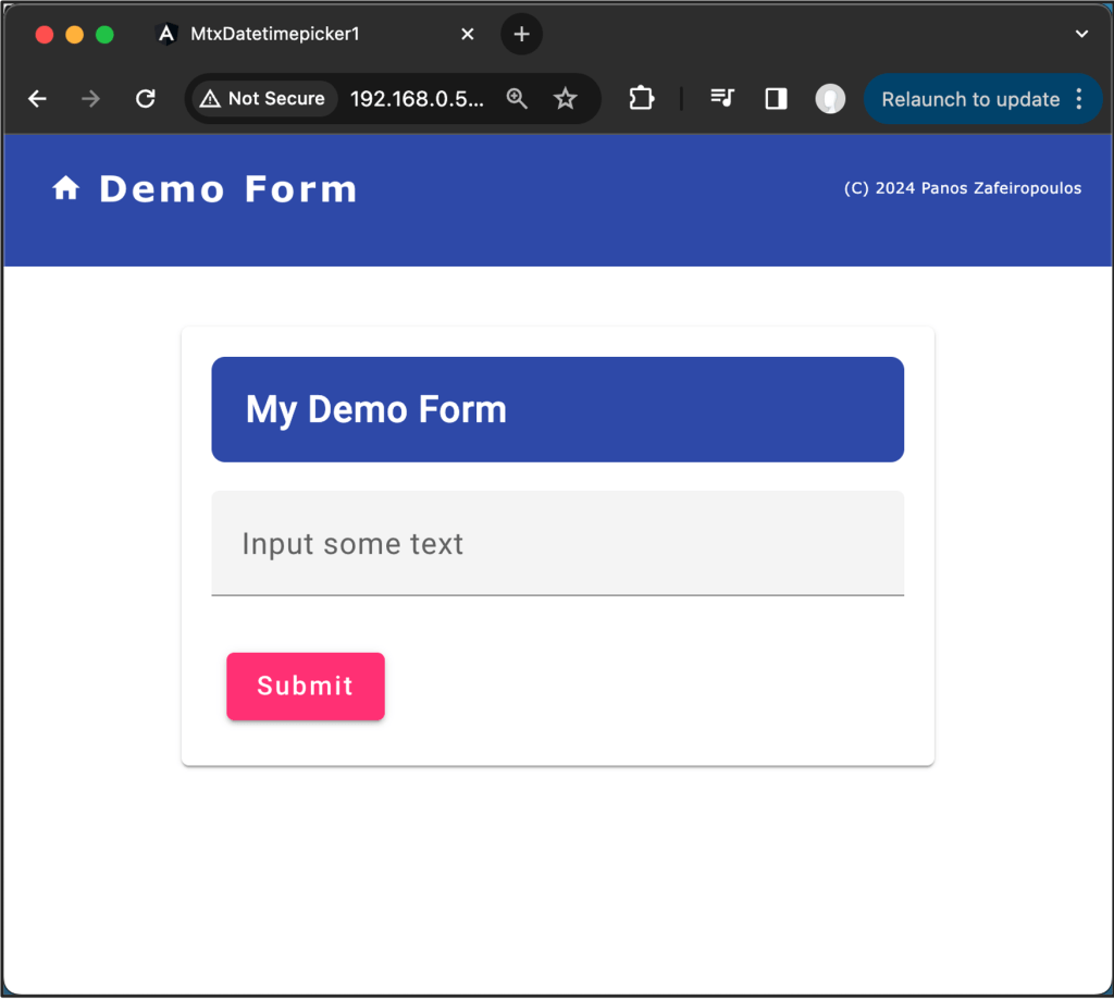
You can also use my ngcr.sh shell-script-tool and create it automatically, from scratch!
So, to start working, use the repo provided (or use the ngcr.sh tool(, or otherwise, you can use your similar form project.
Now, let’s start.
1. The @angular-material-components Datetimepicker
This component is quite promising since it exists for a longer time, and also, because it seems to be the one that is the wider used having more than 68.000 downloads per week (during the time -Jan 22,2024- this post was prepared).
Apart from the Datetimepicker component, the @angular-material-components package, provide also some other components, such as TimePicker, ColorPicker, FileInput, etc. However, here we are will deal only with the Datetimepicker of this library.
Installation is not something special, and the same true for its usage. Instructions are provided, as well as implementation examples.
npm i @angular-material-components/datetime-picker
After the installation, one has to import the key-module(s) of the component, and declare them in the imports section of an ng-module file like app.module.ts, or material.module.ts, etc. Here, we will do it in the material.module.ts.
Apart from the key module ‘NgxMatDatetimePickerModule’, we have also -at least- to import a date/time provider, e.g. the ‘NgxMatNativeDateModule’, otherwise we get an error, similar to:
ERROR Error: NgxMatDatetimePicker: No provider found for NgxMatDateAdapter. You must import one of the following modules at your application root: NgxMatNativeDateModule, NgxMatMomentDateModule, or provide a custom implementation.

We will come back to the date/time providers and their challenges, later on.
So, the material.module.ts becomes:
In the form1 component, we have to add a DateTinePicker control. The form1.component.ts file becomes:
Finally, we have to add the DateTimePicker as a form field in the form template file form1.component.html, which becomes:
And the result is similar to the one below.
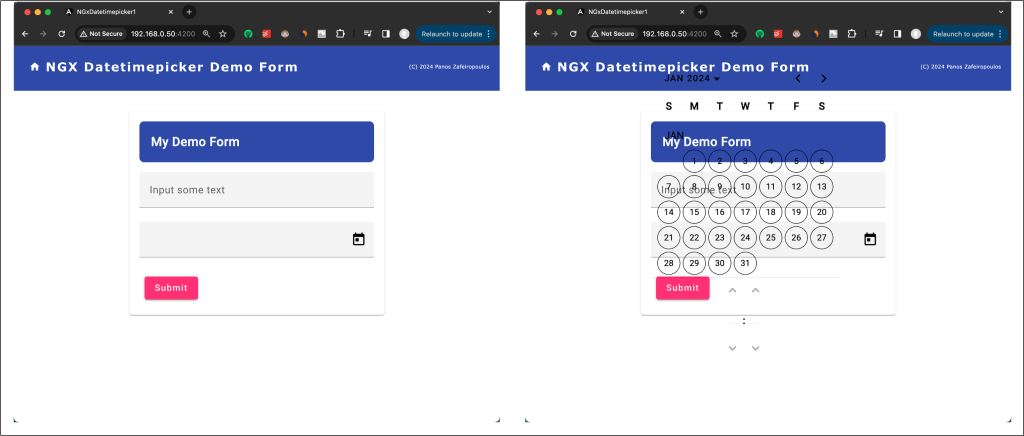
The first thing, which was noticeable to me, was its transparency, or in other words, the pop-up component had not any theme. The documentation provides a few words pointing to the standard Angular Material theming; however, this did not work in my case. And this was quite odd.
After I spent enough time, I concluded that it is an issue caused due incompatibilities between Angular/Angular material versions ^16.x and the latest version (16.x) of the @angular-material-components/datetime-picker, as it is mentioned in GitHub issues here and here. You can check the versions installed, looking at the project’s package.json file.
To test this on my own, I degraded the Angular/Angular material versions to (15.x) with the @angular-material-components/datetime-picker version 15.0.0. The Datetime picker theme inherited OK from Angular material default theme, as it was expected. (Find the “downgraded” demo repo here.)
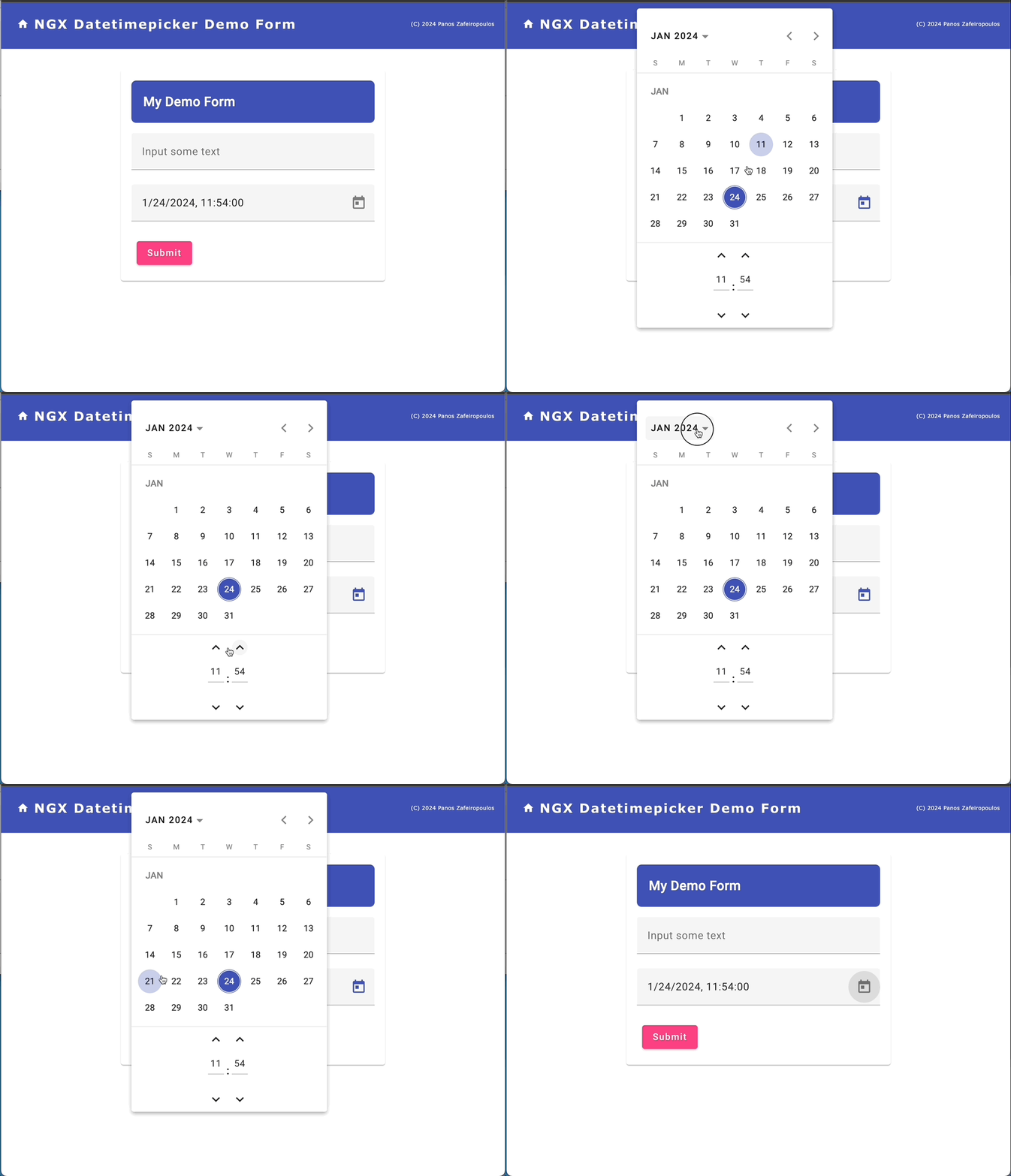
So, this was very disappointing. Till the date this post was written, no update was issued to solve this problem. (Actually, the library has not had any updates since the last 6 months).
A workaround for coloring/theming the date-time picker control is to use your own CSS styles. I tried with some settings gathered from here and there, e.g. add the following CSS script in the form1. component.scss:
This results a colored Date-time picker, as you can see below:
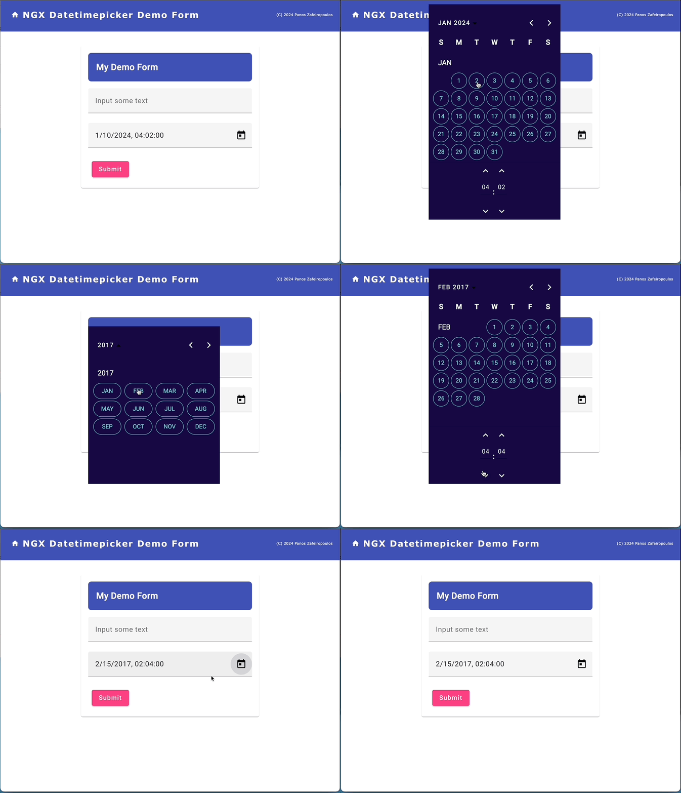
Find the updated commit of the repo here.
Not that bad. However, this is not a standard solution, and thus I decided to go for the other alternative.
2. The Datetimepicker of the @ng-matero/extensions
As a base project you can use the initial commit of the respective repo. Find it here.
You can access the /@ng-matero/extensions here and here.
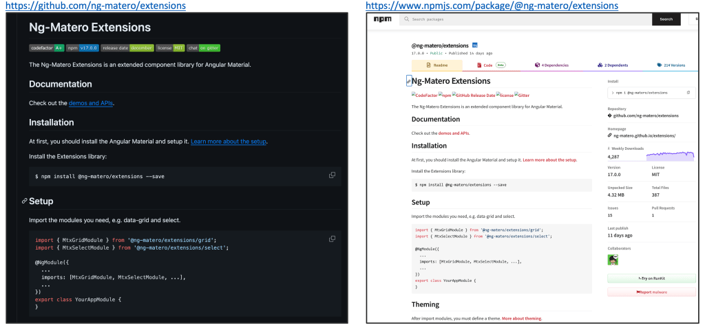
The Datetimepicker is just 1 of the other components/controls offered by the Matero Extensions. See them all here. For an overview and API reference for the Datetimepicker control, see at the official documentation here.
The installation is pretty straightforward. However, be aware that here we will install the Matero Extensions version 16.2.0, since the default version is indented for the newer Angular versions 17.x.
npm install @ng-matero/extensions@16.2.0
Following the same steps as before, we have to make the minimum necessary updates for the
files: material.module.ts, form1.component.ts, and form1.component.html. Find the updated files, below.
The material.module.ts file:
Again, apart from the key-date time picker module, the MtxDatetimepickerModule, we have also to use a respective date-time adapter, such as the MtxNativeDatetimeModule. However, one point here, that needs your attention, is that the MtxNativeDatetimeModule, is not exported by the @ng-matero/extensions/core, instead of the @ng-matero/extensions/datetimepicker. If it is missed, then we get a similar error as the one we’ve seen before:
ERROR Error: MtxDatetimepicker: No provider found for DatetimeAdapter. You must import one of the following modules at your application root: MtxNativeDatetimeModule, MtxMomentDatetimeModule, or provide a custom implementation.

Note, that as we’ve said, we will deal with DateTimeAdapter(s) a bit later on.
The form1.component.ts file:
And the template form1.component.html file:
The result is pretty similar to the one we get before:
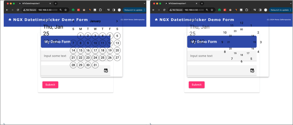
As you can see, this Datetimepicker is also transparent! However, don’t panic. The @matero/extensions use the Angular material theming rules. To apply the default theme colors or any custom theme first we can create a theme SCSS file. For instance, create a new file into the src subfolder of our project, name it, e.g.: ‘mtx_theme.scss’, and insert the following code in it:
I hope that you will find useful the comments provided.
Then import the mtx_theme.scss file into the project’s styles.scss file, like this:
@import 'src/mtx_theme.scss';
That’s it. Now the @matero/extensions Datetimepicker got the theme defined into the mtx_theme.scss file:
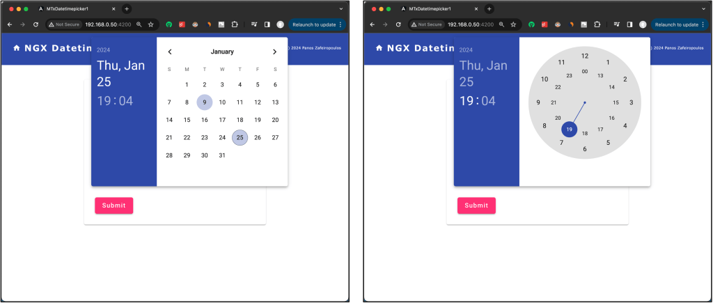
When it comes to what is the value returned from the date-time selection, when submitting the form, it is a string value based on the “standard” JavaScript’s native Date object, i.e.:
“Thu Jan 25 2024 01:40:00 GMT+0100 (Central European Standard Time)”
The format returned is based on the client browser environment.

Native and Moment.js-based modules
As we have already mentioned, both of the Datetimepickers we’ve seen so far, require a DatetimeAdapter provider, otherwise we get an Error. And, this is also true for the Material built-in Datepicker. A DatetimeAdapter provider is a service that uses a date (date/time) object implementation, similar to JavaScript’s native Date object. The “standard” JavaScript’s native Date object is a built-in object that represents a date and time. It provides methods for working with dates and times, allowing us to perform various operations such as creating dates, getting and setting pieces of the date object (like year, month, day, hour, minute, second), and performing arithmetic operations.
So, when we use a date/time picker, we need to choose a date implementation and provide it as a service. A corresponding native date-time module provided is one of the options we can choose. Such a module uses JavaScript’s native Date object for its date representation.
For the Datetimepickers we saw before, we used the corresponding native date-time module: the MtxNativeDatetimeModule and the NgxMatNativeDateModule respectively. This is OK for any basic approach. However, it is worth mentioning that a native date-time module (like implementations based on the JavaScript Date object) has known limitations in handling time zones, and the parsing of date strings can be a bit painful and inconsistent across different browsers.
So, when we need to handle time zones or need a more flexible and consistent behavior, it might be better to use an alternative. The widely used alternative is to use a Moment.js-based module.
Moment.js is a JavaScript library for parsing, validating, manipulating, and formatting dates. It provides a convenient and flexible API for working with dates and times in JavaScript, offering a range of features for tasks such as parsing and formatting dates, calculating durations, and manipulating Date objects.
Let’s take a quick look at the key features of Moment.js, using some elementary examples:
Parsing and Formatting: Easily parse dates from strings or format dates into strings according to a specified format, e.g.:
const today = moment(); // Current date and time
const customDate = moment("2022-01-01", "YYYY-MM-DD"); // Parse a specific date<br>
const formattedDate = customDate.format("MMMM D, YYYY"); // Format date as "January 1, 2022"
Manipulation: Manipulate dates by adding or subtracting years, months, days, hours, etc. , e.g.:
const futureDate = moment().add(7, 'days'); // Add 7 days to the current date<br>
const pastDate = moment().subtract(1, 'month'); // Subtract 1 month from the current date
Display Relative Time: Show relative time (e.g., “2 hours ago”) for better human readability, e.g.:
const timeAgo = moment("2022-01-01").fromNow(); // "3 months ago"
Locale Support: Moment.js supports localization, allowing you to format dates based on the user’s locale, e.g.:
const localizedDate = moment().locale('fr').format('LLLL'); // Format date in French locale
Parsing from Various Formats: Parse dates from a wide range of input formats, e.g.:
const parsedDate = moment("2022-01-01T12:00:00Z"); // Parse ISO 8601 date
So, using a Moment.js-based powerful module, seems to be a better approach.
You have probably noticed (in the errors we saw before), that both of the aforementioned Datetimepickers also provide Moment.js-based modules, and this is also true for the Material Datepicker. The following table summarizes them:

Thus, using the NgxMomentDatetimeModule with the previous @angular-material-components datetimepicker, and the MtxMomentDatetimeModule with the @ng-matero/extensions, are more powerful options, offering quite handy date/time transformation methods, like the ones in the examples above.
Note: The MtxMomentDatetimeModule is based on the material-moment-adapter and ng-matero/extensions-moment-adapter. This is because the Angular Material built-in DateAtapter (which supports the Material Datepicker), allows subclassing of any other adapter implementation (even custom ones). See here. This is also true for some other implementations (i.e.: luxon and date-fns) we will see later on.
So, for our case project, we can substitute the MtxNativeDatetimeModule with the MtxMomentDatetimeModule in the materials.modules.ts. However, be aware that it requires to be imported from a separate package: the @ng-matero/extensions-moment-adapter. So, we have to install this package, and more precisely, version 16.0.0 of it (since the default version is aligned to the newer Angular versions 17.x). However, since it is based on the @angular/material-moment-adapter, we have to install this package, as well. (Note, that the is not installed by default when we install the @angular/material). Since we have installed @angular/material version 16.2.13, we can select the same version for the @angular/material-moment adapter to be installed.
npm i @angular/material-moment-adapter@16.2.13 @ng-matero/extensions-moment-adapter@16.0.0
After the installation, the material.modules.ts file becomes:
That’s OK and the app works pretty as the same as before.

When we submit our form, we actually get a value from the selected date/time that is a Moment object, and the date/time returned as the _d property of the object, as you can see above, in a format:
“_d: Fri Jan 26 2024 11:52:00 GMT+0100 (Central European Standard Time”
Interesting is that there are other moment property objects that we can use, for easily getting the part of date-time we wish, e.g.:
_i: {year: 2024, month: 0, date: 26, hour: 1, minute: 5}
etc.
Another important point is how the selected date-time is presented in the UI (in the input field box). When selecting a date-time it is displayed in the input field box in the format “MM/DD/YYYY HH:mm” (the time is in 12-hour format AM/PM), e.g.: “01/26/2024 8:05 AM”. But how we can manipulate the dates (date/time objects) returned from the date and time selection? How, for instance, we can transform a selection to our preferred locale?
The MTX_DATETIME_FORMATS object
Of course, we can use our own custom transformations using the moment.js as in the examples we saw before. But a better might be and easier way is to use the built-in MTX_DATETIME_FORMATS object.
The MTX_DATETIME_FORMATS object is a collection of formats that the Matero Datetimepicker uses when parsing and displaying dates. These formats are passed through to the DatetimeAdapter we use (and in our case, this is the job of the MtxMomentDatetimeModule). We can customize the MTX_DATETIME_FORMATS object, by creating and providing our own MTX_DATETIME_FORMATS object. (It is exported as an InjectionToken of the MtxDatetimeFormats interface type).
Worth mentioning, that MatMomentDateModule from Angular Material provides also the MAT_DATE_FORMATS InjectionToken. However, we can deal with date-only formats for MatDatepicker. This is because the MatDatepicker supports only dates, not times. Here, we will stop only at the MTX_DATETIME_FORMATS object.
So, we can use our own MTX_DATETIME_FORMATS object. We can either inject (‘provide’) it, in our module (e.g.: as a provider in the material.modules.ts), or (if we don’t like it to be widely available), we can do this in the specific component we use our datetimepicker implementation. In our case, this is the form1 component. In order to do this, we have to import it from the @ng-matero/extensions/core, and then we have to add it to the providers array section, of the form1.component.ts file. An example is given below:
Re-running the app, and selecting a date-time you can see that the date-time displayed in the input field-box in the format we defined in the datetimeInput property in the display section:
datetimeInput: 'YYYY-MM-DD HH:mm:ss'
E.g.:
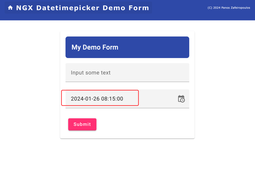
You can play around with changing the values of the properties provided by the MTX_DATETIME_FORMATS, and see how you can adapt them to your case. For instance, the datetimeInput property in the parse section is used to parse a date-time string which should follow the format provided in that value, e.g.: “YYYY-MM-DD HH:mm”. If you wish to set a date-time string as an initial value in the field, then this string should follow this format, otherwise the parsing will fail. E.g.:
fbGroup.addControl(this.dt1ControlName, new FormControl("1973-11-17 20:30"));
Note that you can also use locale aware string formats like ‘L’, ‘LL’, ‘LT’ etc. See more here:
Apart from the customizations with the MTX_DATETIME_FORMATS, the Matero datetimepicker offers a wide number of properties that one can use, and modify, to configure it to meet her/his needs. You can also find some example implementations in the official documentation here.
Find the updated commit here.
However, we are not going to go through detailed examples on this subject, since you can do this on your own, and also because we remain focused on the challenges that one can face trying to implement it. Now it’s time to deal with one more challenge: Moment.js has been deprecated!
The Moment.js alternatives
Maybe, you have already seen the Warning message in the console:
WARNING
/Users/DEV/PROJ/AngularProjects2/mydemos/MTxDatetimepicker1/node_modules/@ng-matero/extensions-moment-adapter/fesm2022/extensions-moment-adapter.mjs depends on ‘moment’. CommonJS or AMD dependencies can cause optimization bailouts. For more info see: https://angular.io/guide/build#configuring-commonjs-dependencies

And this is because of the Moment.js.
The Moment.js was something like a “must” in the JavaScript world. It has existed since 2011 and is widely used, providing standard support for Date/Time management like locales, time zones, flexible date parsing capabilities, etc. Even the fact that this library has been successfully used in millions of projects (14,6 million downloads per week! — Jan 2024), it seems that reached its end.
Now it remains a legacy project in maintenance mode since September 2020.

The problem is that Moment.js is packaged with CommonJS (it is not an ECMAScript module) and its objects are mutable. The Moment.js guys recognized this, and they recommend whenever is possible (e.g.: new projects), developers use an alternative.
See recommendations here.
Below we will see how to replace Moment.js with:
a. The Luxon library: a modern alternative to the Moment.js
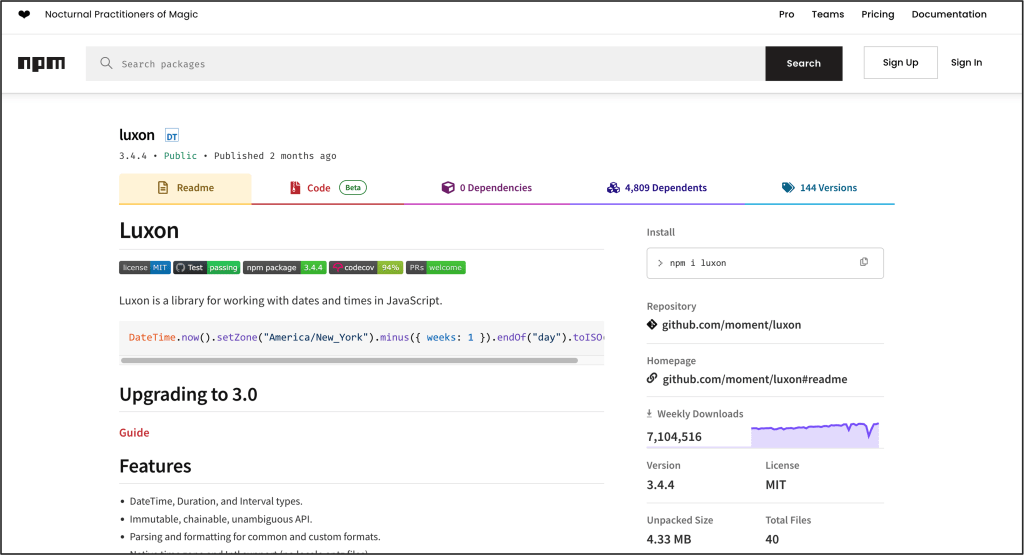
One of the alternatives is the Luxon library which is considered as the evolution of Moment (it is authored by Isaac Cambron, a long-time contributor to Moment).
Read more about Moment.js status and the recommendations at:https://momentjs.com/docs/#/-project-status/
The Luxon, even though it uses a lot of the Moment.js concepts, has no-nonsense differences with it, with the key difference being the Luxon date-time objects’ immutability. See more at the official Luxon documentation here.
The solution for the @matero/extensions and Datetimepicker
The good news is that the Matero guys have already a Luxon-based adapter -the ‘MtxLuxonDatetimeModule’ – that can replace the moment-based -the ‘MtxMomentDatetimeModule’. The same is also true for @angular/material, it also provides a material-luxon-adapter.
For this purpose, first, we have to uninstall the @ng-matero/extensions-moment-adapter, as well as its counterpart, the @angular/material-moment-adapter, and then install the @angular/material-luxon-adapter, and @ng-matero/extensions-luxon-adapter (together with its Typescript declarations type file) packages.
npm uninstall @ng-matero/extensions-moment-adapter @angular/material-moment-adapter
npm i @angular/material-luxon-adapter@16.2.13 @ng-matero/extensions-luxon-adapter@16.0.0
npm install --save-dev @types/luxon
Using MtxLuxonDatetimeModule
After the installation we have to make the necessary adaptations to our code.
The material.modules.ts file becomes:
And the form1.component.ts becomes:
Please note that the MTX_DATETIME_FORMATS for Luxon have some differences, so it will be good to access the related official documentation. E.g.: for the formatting tokens used in string parsing and formatting with Luxon you can see here and here.
Find the updated commit here.
b. The date-fns: light and fast
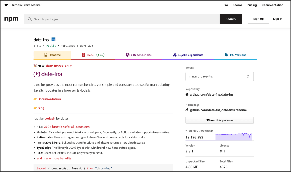
date-fns is a very popular, robust, lightweight JavaScript library, and it is also considered as immutable as the Luxon. Date-fns follows the philosophy of small, focused modules, allowing developers to pick and choose only the functionalities they need, minimizing unnecessary bloat in their projects. A bit challenging point might be its requirement for specifying an initial locale, but on the other hand, think positively and grab the chance to open the door for the internationalization of your app(s).
The solution for the @matero/extensions and Datetimepicker
As with the Luxon case, the Matero guys also provide the respective adapter: @ng-matero/extensions-date-fns-adapter and the MtxDateFnsDatetimeModule. And the same is also true for its counterpart the @angular/material-date-fns-adapter.
Before using them, we have to uninstall the @ng-matero/extensions-luxon-adapter and the @angular/material-luxon-adapter, and then install them. The steps are pretty similar to the previous ones.
npm uninstall @ng-matero/extensions-luxon-adapter @angular/material-luxon-adapter @types/luxon
npm i @angular/material-date-fns-adapter@16.2.13 @ng-matero/extensions-date-fns-adapter@16.0.0
Using MtxDateFnsDatetimeModule
As we did before with Luxon, after the installation we have to make the necessary adaptations to our code.
The material.modules.ts file becomes:
Then, let’s see if we have to update our form1 component. No changes required to MTX_DATETIME_FORMATS for the date-fns.
See here the date-fns format patterns, and any specificities.
Thus, one should have expected that since the MTX_DATETIME_FORMATS settings can be left as they were with Luxon, our Datetimepicker should work fine. However, here is the tricky point that we should pay attention to. If you try to toggle the Datetimepicker, you will face an error similar to:
ERROR RangeError: locale must contain localize property

The error reveals the fact that the date-fns requires that a locale should have been set, before using it with our Datetimepicker (via the MtxDateFnsDatetimeModule implementation and its dependencies).
“A locale identifies a region (such as a country) in which people speak a particular language or language variant. The locale determines the formatting and parsing of dates, times, numbers, and currencies as well as measurement units and the translated names for time zones, languages, and countries.”
In general, locales comply with the ISO 639-1 2-letter language code, followed by the ISO 3166-1 alpha-2 county/local code.
Generally, Angular offers the @angular/localize package from where we can obtain a locale id (a locale code) and provide it in a module (or component), e.g.:
. . .
providers: [
    { provide: LOCALE_ID, useValue: "en-US" },
. . .
Angular Material also uses locales for its Datepicker component. Angular Material uses the MAT_DATE_LOCALE that can be used to assign a locale per module (or per component). For instance, we can add a provider that provides the MAT_DATE_LOCAL, with the standard code we wish:
. . .
import { MAT_DATE_LOCALE } from '@angular/material/core';

 . . .
. . .
  providers: [
    // { provide: MAT_DATE_LOCALE, useValue: 'en-GB' },
    {provide: MAT_DATE_LOCALE, useValue: 'en-US'},
. . .
date-fns follows almost the same coding standard. However, we have to import the locales as objects. (date-fns locale objects are missing hyphen ‘-’ in-between). For instance, for the English language in England, it is enGB, and in the USA, it is enUS. Note, that we can also use only the 2-letters (alpha-2) language code, without the country code. In a component, we can import such a locale (as an object -not a string) like this:
import { enGB, fr, el } from 'date-fns/locale';
This allows us to manually require just the necessary locales when needed.
After we have imported the locale(s) we wish, we have to provide one into our Datetimepicker instance. You might find some different methodologies elsewhere, however here, an approach is to do it via injecting the material DateAdapter into our form1 component. Then, in a component method, we can pass it the locale we wish, via the adapter setLocale() method. Thus, the locale is available to the date-fns implementation (subclassing) adapters, and therefore to our Datetimepicker.
This approach also allows us dynamically change the locale passed in the adapter, whenever we want.
So, our form1.component.ts becomes:
Since we have set the locale to el (:Greek language), the popup calendar of our Datetimepicker will look like this:
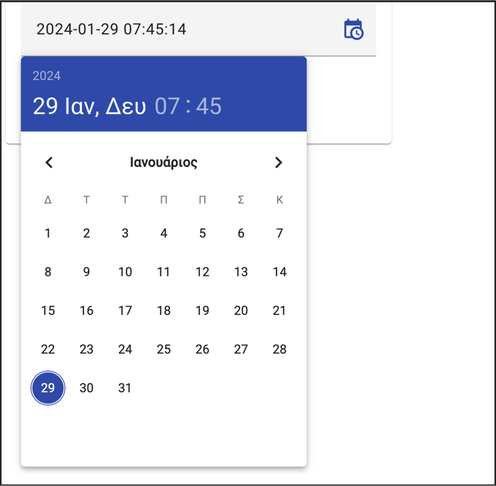
Find the updated commit here.
Before concluding, I’d like to add a few more code lines, just to show how you can dynamically switch locales, and start thinking about your app internationalization.
So. instead of manually switching to locales, we can do it dynamically for a locale coming from the client browser. There are different ways to get the client browser locale, however, a common approach is to get the locale from the language preferences/settings of the client browser. For instance, in the Chrome browser, one can set her/his 1st preferred language in Settings -> Languages:
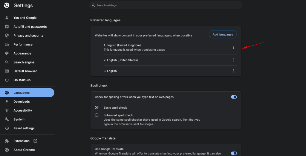
In Angular, we can capture the preferred browser language, via the DOM Navigator object and its language property. This returns a read-only string consisting of either the 2-letter code of the language or the 2-letter code followed by a hyphen and the 2-letter country code.
In our case we can modify a bit our code to switch the DateAdapter locale to the one traced via the navigator. locale. So, the form1.component.ts, can be adapted like this:
For more advanced approaches, you can also guess the language/country from the client ip (e.g.: via using an interceptor). Furthermore, you can start digging on your app internationalization in general, and not only for Datetimepicker locales. You can start reading the official documentation for Angular internationalization here. For translation needs, you might also need to take a look at the ngx-translate package.
Dealing with the ‘Violation’ warning message for non-passive event listener
It is worth mentioning at this point, for a warning message that one has probably already noticed in the Chrome browser console.

The warning message is shown when the user clicks on the day selection of the Matero datetime-picker. The warning is shown because of the new feature added in Chrome 51 and afterward, for providing some boost to scroll performance (https://chromestatus.com/feature/5745543795965952).
Since the Matero extensions with the datetime-picker is a 3rd party package, we can not intervene in it, so we have to deal with it on our own. Note that some node packages can be installed and configured to deal with this issue, (e.g. passive-events-support, ng-event-plugins, etc.). But here I will follow Angular solo.
Angular supports binding to passive event listeners. So, to avoid such a WARNING/Violation message, we can define a global variable making an event passive (the ‘touchstart’ in our case). We will use the steps given here.
1. Create a file zone-flags.ts under src directory.
2. Add the following line to this file.
(window as any)[‘__zone_symbol__PASSIVE_EVENTS’] = [‘touchstart’];
The next step should have been to use the polyfills.ts file. However, Angular since version 15, does not generate (by default) a polyfills.ts file. It uses a polyfills section directly into angular.json file. So, we have to add our zone-flags.ts file, in the polyfills section (under projects->architect section) into the angular.json file.

Finally, before using it, we have also to compile it. Thus, we have also to add it in the files section into the tsconfig.app.json file.
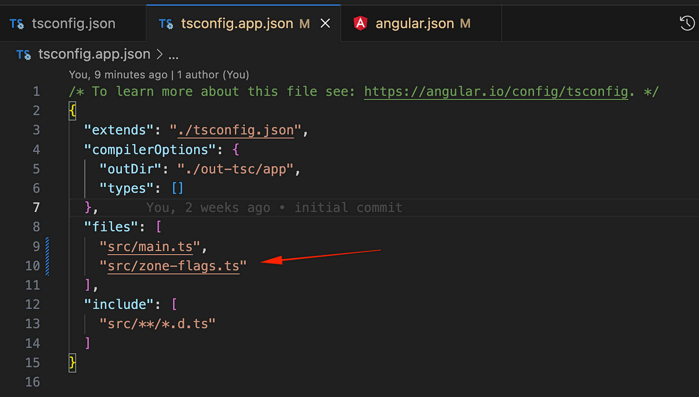
Note that in the case we have more than 1 files to be added in the polyfills section, we can always create a polyfills.ts file and gather all these files into it. Then, we can add just this file instead of adding all the polyfills files one by one.
So, that’s it! No more warnings in the Chrome console. Find the final repo commit here.
Conclusions
As you have understood, from the time spent in this post for the @matero/extensions/Datetimepicker, I think this is a good option for the time being. However, honestly, speaking, I wouldn’t say I like its time selection via the circled clock-like UI (yet quite fascinating). I prefer the hour and minute arrows provided in the @angular-material-components/datetime-picker (I think this is a more practical UI). But till the guys there -or someone else- fix the theming issues, I will stay with the Matero.
So, that’s it. Thank you for reading.
Stay tuned, while keep coding!
Thank you for this very thorough and thoughtful article.
Thank you for sharing your experience. This article was very helpful.