Angular: Build gradually, your fully dynamic, flexible reactive form

240131-0419
Do you know that there are 2 types of dynamic forms? One without dynamic components and one with? Here you will learn about both of them. You’ll gain a solid understanding of how to approach creating angular dynamic forms, and you will also obtain a good grasp of many other Angular subjects.
Intro
This is a step-by-step practical, yet easily followed post with code implementation, to learn to create fully dynamic, flexible reactive forms in Angular. The first part of the post starts creating a simple dynamic form based on an array of metadata, without dynamic components, continues to the second part by implementing dynamic components for each form element, and finally beautifies the UI using the Angular Material library. The full example repo is provided, including all the step-by-step commits.
The post was initially Inspired by Todd Motto’s post here. The code implementation is based on Angular 16 (16.2.12) and module(s)-based components. However, I have another comprehensive post about an Angular 17 implementation based on standalone components. As a result, the reader can profit from reading both posts to see and compare the new Angular 17 features later on. You can find the Angular 17 post below:
It is presumed that the reader has already obtained some familiarity with Angular basic concepts (Components, Services, Observables, etc.) and especially with Angular forms (reactive forms) and related subjects such as formbuilder, formgroup, etc. Also note, that in this post we are going to use the VS Code, as our editor/IDE tool.
If you want to start a new Angular/Material project from scratch, it will be helpful to you to take a look at another post of mine:
Even better, though, would be to get the repo’s first commit here. When you have obtained it, don’t forget to run “npm install”, to obtain also the necessary packages. Its description is provided below, and after that, you may begin by following the rest of this post and implementing the dynamic form step-by-step.
The initial repo
The initial repo consists of the Angular standard: “app.module.ts” file, and the “AppComponent”. We also use a separate module, the “material.module.ts” that is used for gathering all the Angular Material modules used in the project. Then, we have included the “HomeComponent” (“home” folder), which provides a simple header (toolbar) for our app. These modules and components are considered “standard” for almost any Angular project, however below are the rest of the components, services, files, etc. that are included in this initial repo.
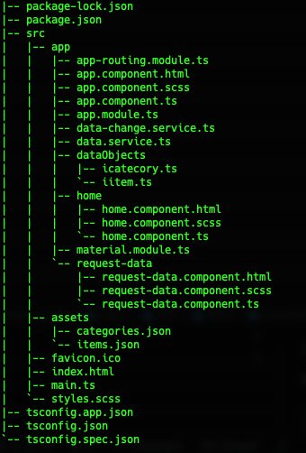
We aim to build a dynamic form for an item, that will be able to obtain initial values for its fields. For demonstration, we will use a couple of external JSON files containing some sample data, instead of fetching data from a real database. The initial demo data are provided by the files “items.json” and “categories.json” that are placed inside the “assets” subfolder, of our project. Actually, the information from a set of items and -later on- a set of categories, will be used. This means that we have also to match the item and category fields to corresponding entities. Thus, a couple of interfaces (“IItem” and “ICatecory”), are also required. Both of the respective files: “iitem.ts” and “icategory.ts” are located in the “dataObjects” subfolder.
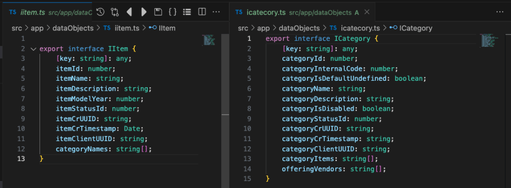
To retrieve the data for starting values, we therefore require a service. The initial example data service is the “DataService” and can be found in the “data.service.ts”. It contains the 2 data-obtaining methods “getItems” and “getCategories”, as well as a very simple error handler that raises an alert message.
Since we want to be able to fetch the data (the field values) of a chosen item, we have also implemented a very simple form consisting of just one field and a button, allowing the user to select the ID of the item to be fetched. This is the “RequestDataComponent” (“request-data” subfolder).
But how we can respond to different ID values requested by the user? Another service is required to do the job. This is the “DataChangeService” in the “data-change.service.ts”. The service uses Subjects (“setItem” and “setCategory”) which are triggered (or can be triggered) whenever the user changes the ID value. Then, we can subscribe to the observables (“getItem” and “getCategory” methods) of this service to monitor the ID values entered by the user and respond accordingly by fetching the appropriate data (e.g. a record).
Don’t forget to download the 1st commit of the repo here and run the “npm install”. After that, running the repo you get the initial view of our app:
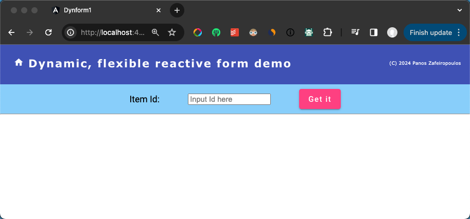
Now we are ready to proceed by first, dealing with a dynamic form without dynamic components.
A. Dynamic form without dynamic components
In this initial approach to a dynamic form, we will go through the steps to implement a dynamic form. The concept is more-or-less similar to the introduction officially presented as an example of building dynamic forms, here. I will try to keep this simple by presenting the implementation in a ‘learn-by-doing’ manner, aiming to understand easily why we need to do this or that. Then you can digest much better the official example. For instance, in the official example, classes are used, but I prefer objects, because we can start using very few object properties, and then we can add more, explaining in each step, why we need to add and use them. Of course, we will also ‘protect’ our objects by providing the necessary interfaces and custom types.
Since we are going to implement a form, first of all, we need a form component. E.g.:
ng g c form --skip-tests=true --module=appThe 1st fundamental yet important concept here is that this form will play the role of a form-container component, as we will see later. The 2nd. is that we use an array of objects with field/controls properties, (for which we might not have any knowledge). Having such an array of field/controls objects in place, we can build our reactive form by adding each control object and iterating through this array. Note that, many times, we will use the terms ‘control(s)’ and ‘field(s)’ interchangeably.
The very basic properties, common for any field/control
Let’s start with a few properties that can be common for any control of our form, e.g.:
- controlType
This should define the basic type of the control, e.g.: input, select, checkbox, button, etc.
- controlName
The identification name that we will use to add this control to the reactive form group array
- fieldLabel
The text/string that we will use to provide the vital info about the control, e.g.: as a label for an input field, or a button text.
- inputType
This should be used to define further the nature of the field. E.g.: in the case of the field of type “input”, this property can take a value, like: ‘text’, ‘number’, ‘password’, etc. In the case of a button, this should take the ‘submit’ value, etc.
In the following array, we define just the first 2 of the form fields:
const ItemsFormFields = [

  {
    controlType: 'input',
    controlName: 'itemName',
    fieldLabel: 'Item Name:',
    inputType: 'text',

  },
  {
    controlType: 'button',
    controlName: 'submitButton',
    fieldLabel: 'Submit:',
    inputType: 'submit',
  },

]
The Form component
For now, we will place this array inside the “form.component.ts” file. After that, we can inject the FormBuilder service and easily create our form (form group) by adding each control and iterating through the form fields array, e.g.:
    const fbGroup = this.formBuilder.group({});
    this.formFields.forEach((field) => {
      fbGroup.addControl(field['controlName'], new FormControl(""));
    });
    this.dynFormGroup = fbGroup;
Below you can find the whole example code for our FormComponent:
Note that we have renamed the default selector to “dyn-form”.
The same “iteration” logic, can be also used, in the HTML form template can be the same as before: We can iterate through the array of field objects and shape the HTML code using standard (built-in) Angular structural directives, like ngFor and ngSwitch. Here’s how we can do it:
Note that, a simple style has been added to the “request-data.component.scss”. Finally, we have added the form component selector <dyn-form> in the request-data template (“request-data.component.html”).
Here is what the output looks like:
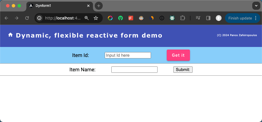
Find the 2nd Commit of the repo here.
Adding a new form field/element
Now it is very easy to add a new form field. We can do that just by adding an object to the form fields array. E.g. we can just add like this:
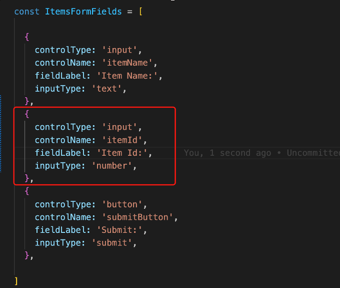
And the result is:
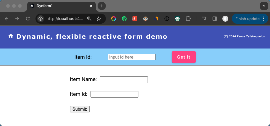
Note, that we have also adjusted the style sheet/html, to arrange the fields vertically. But, mind that the style sheet is not a goal here.
Find the 3rd Commit of the repo here.
Setting initial values
Now we can change a bit, our code for displaying some initial values in the form fields. For this purpose, we can add one more property in each object of our ItemsFormArray, e.g.: a property with the name initialValue. This property should not be mandatory for every field object in the array, for instance, we can miss this property for the button field.
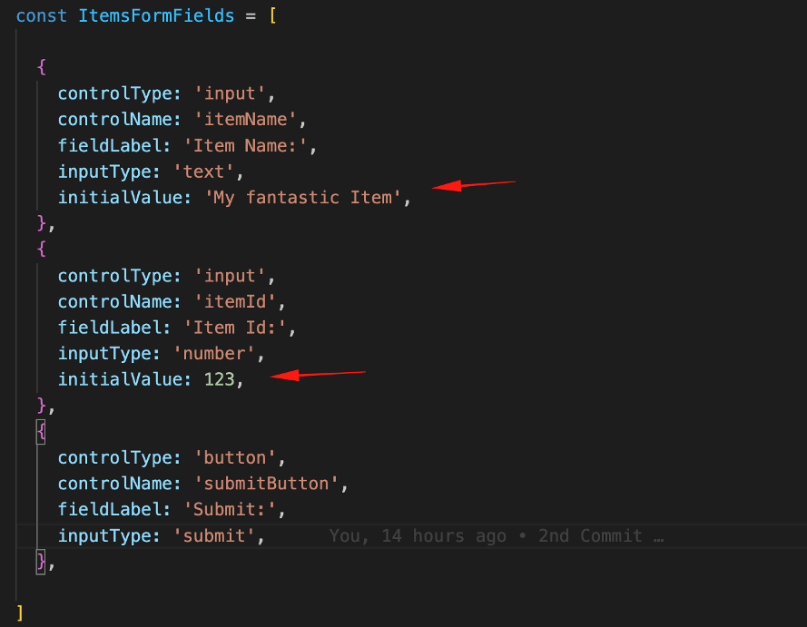
Then we can change our code for assigning the initial values to the created controls of our form. For our purpose, we can use a new method, e.g.: setFormValues().
In Angular reactive forms, we can use a couple of ways to set the values in the form controls. I think it would be better to use patchValue for each form control instead of using the setValue for the whole form group. This is mainly because the setValue method requires all the form controls to be set, otherwise it will throw an error. So, in our case, I used the setFormValues() method to patch the form controls with initial values.
  setFormValues(): void {
    for(let control in this.dynFormGroup.controls){
      this.formFields.forEach((field) => {
        if(field['controlName'] === control){
          this.dynFormGroup.controls[control].patchValue(field['initialValue'])
        }
      });
      console.log(">===>> " + control + " - " + this.dynFormGroup.controls[control].value);
    }
  }
We can call the setFormValues() method from within the ngOnInit() method after the initialization of our form. Below, you can see the result:
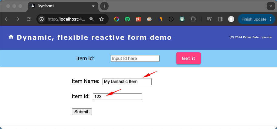
Important: The ngDefaultControl attribute was added in the form template in the form button element,

to avoid getting the error “Error: NG01203: No value accessor for form control name: ‘submitButton’.”.

Find the 4th Commit of the repo here.
Standardize the form field properties
So far, we haven’t used any standard way for defining the form field properties in the objects array. So, it’s time to do so to keep the consistency of future additions or changes in the properties’ definition and usage. For this purpose, we can use an interface. Moreover, it is better to decouple the array from our form, and use separate files, for both: the interface for properties definition and the array of the fields. Actually, we will put them in the dataObjects folder of our app.
The initial IFormField.ts
The initial itemFormFields.ts
You have probably noticed above, that I’ve commented out the initialValue properties. This is because we want to get the values via the get-data component (and the associated data service).
Setting form control values from fetched data
So, what we want is to pass the values from a fetched data object (e.g.: a record from a database), to the initialValue properties for each field of the ItemsFormFields array. To do this, it is necessary to link each object of the ItemsFormFields array to a corresponding field/column of the data (e.g.: ‘record’) fetched. Thus, it is necessary to add another property into the interface, and then we can use it in the ItemsFormFields array. We can name whatever we wish the new property, but it is better to use something that makes sense, e.g. dbColumn, dataColumn, etc. Here I will name it ‘dataField’.
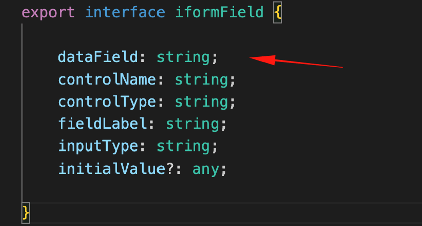
Now, we can update the ItemsFormFields array, using the respective ‘data fields’ from the IItem interface:
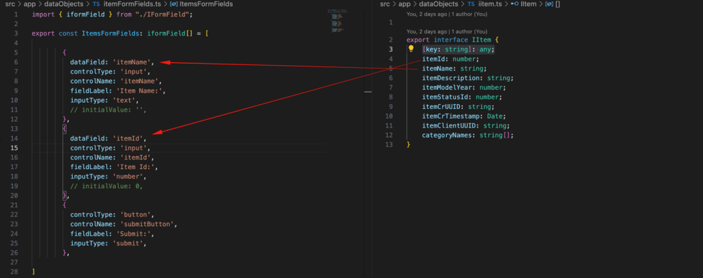
Actually, what we will do, is get the item values from an item object fetched in RequestDataComponent (when we click on the ‘Get It’ button, via the from the DataService), and use them to set the values of the matching form controls in the FormComponent.
Since in the RequestDataComponent template, we host the FormComponent template selector, we can establish a parent-child relationship between them, and thus, we can @Input a fetched item object into the FormComponent.
Using the DataChangeService
However, for this purpose, it is preferable to use the DataChangeService as a shared service between the 2 components. Recall that we have already had the DataChangeService from the early beginning. Then, we can inject the DataChangeService into our FormComponent and subscribe to its getItem() observable, in the ngOnInit lifecycle hook method, e.g.:
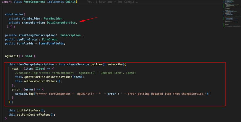
For assigning the values whenever they are updated (actually, after a user clicks on the RequestDataComponent, ‘Get It’ button), we can create a new method, e.g.: the ‘updateFormFieldsInitialValues()’ method, and call it from within the subscription. For setting the form controls values we have also to call the ‘setFormControlValues()’, after we call the ‘updateFormFieldsInitialValues()’. The updated form component is given below:
And the result is as it is expected:
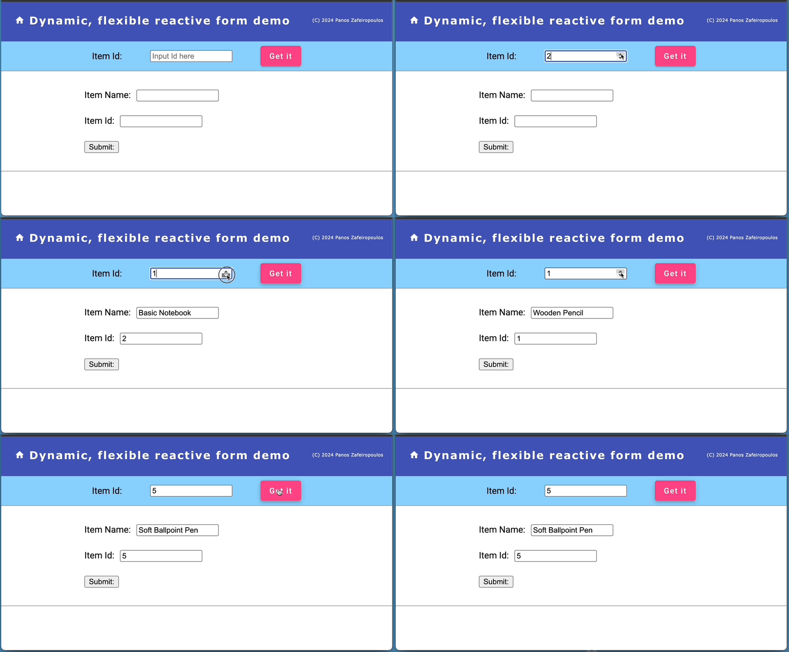
Find the so far 5th Commit of the repo, here.
Adding a select (dropdown) field
The next step is to add a select field for a dropdown control in our form. For this, we need to add a new field object in the ItemsFormFields array and set the controlType value to ‘select’. E.g.:
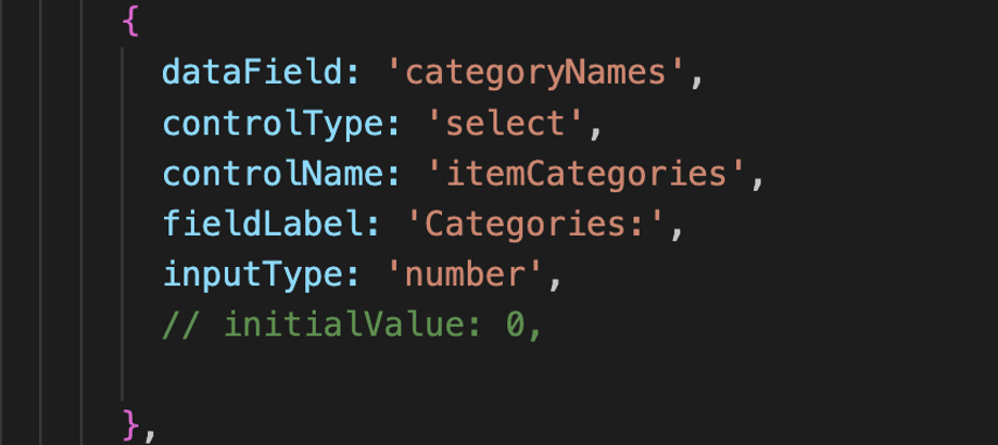
There are a few things here that guide us to some changes. First, a ‘select’ form element, is based on the ‘select’ HTML tag, and not on the ‘input’. So, the inputType can be missed, and thus we can make it optional in the IFormField interface. The next thing is about the option values that should be provided for selection. For this, we can add one more property of an array type in the IFormField interface, e.g.: “options?: any[]”, and then use it in the added object in the ItemsFormFields array.
An array of any type is flexible, however, we have to think the consistency. So, a better approach is to use another custom interface instead. Generally, this should be a key-value pair object, so we have to define at least 2 properties for the key and the option value. But we can add a couple more optional properties that obviously, might be useful in the future. So, we can add the ‘IFormOptions’ interface and use it as the type of the options property, e.g.: “options?: IFormOptions[]”: in the ‘IFormField’ interface. Then the IFormOptions.ts file with both interfaces becomes:
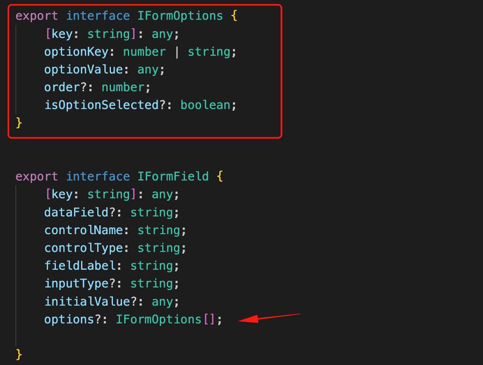
And the added object in the ItemsFormFields array becomes:
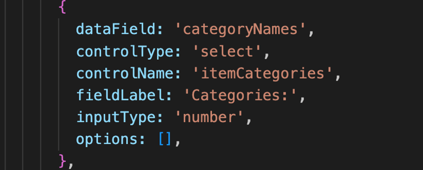
We intentionally left empty the array, because I want to fill it with the categories returned from DataService. But again, we will use the DataChangeService for updating any item-selected values.
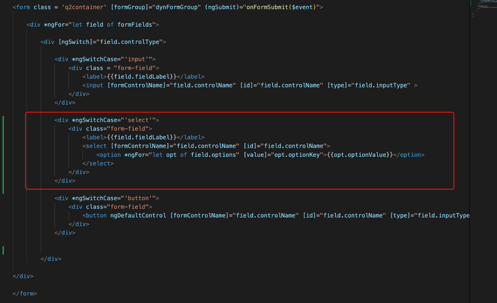
Now, let’s do it. First, we have to adapt the FormComponent template by adding an ng switch-case covering the “select” element.
. . .
<div *ngSwitchCase="'select'">
  <div class="form-field">
     <label>{{field.fieldLabel}}</label>
     <select [formControlName]="field.controlName" [id]="field.controlName">
     <option *ngFor="let opt of field.options" [value]="opt.optionKey">{{opt.optionValue}}</option>
      </select>
  </div>
</div>
. . .
The above HTML snippet for the select element displays the values, but it returns the selected key value as a form-control value, which in our case the category id number. Note also, that this initial implementation is for selecting only 1 option. We will see a bit later, how we will change it to be “muti-select”.
Next, we have to inject the DataService in our FormComponent class (via Constructor again). Then, we will use a method to fetch the categories from the DataService and assign the options for the select field. Since we might have more than 1 select field, it’s better to point out which one we wish to update, and for this, we can use the value for the respective controlName property. The job can be done by the following method “updateOptions()”:
. . .
  updateOptions(cotrolName: string) {
    this.dataServise.getCategories().subscribe((categories: ICategory[]) => {
      //console.log('>===>> updateItem() - categories', categories);
      let options: IFormOptions[] = [];
      categories.forEach((category: ICategory) => {
        options.push({optionKey: category.categoryId, optionValue: category.categoryName});
      });
      this.formFields.forEach((field) => {
        if( field.controlName === cotrolName && field.controlType === 'select') {
          field.options = options;
        }
      });

      this.changeService.setCategories(categories);
    });
  }
. . .
This should be a one-off call, and we can call this method from the ngOnInit life-cycle hook (before form initialization).
. . .
this.updateOptions('itemCategories');
. . .
But if you wish you can subscribe to the DataChangeService to keep updating for categories changes. Here this is not necessary.
Below you can get a taste of the result:
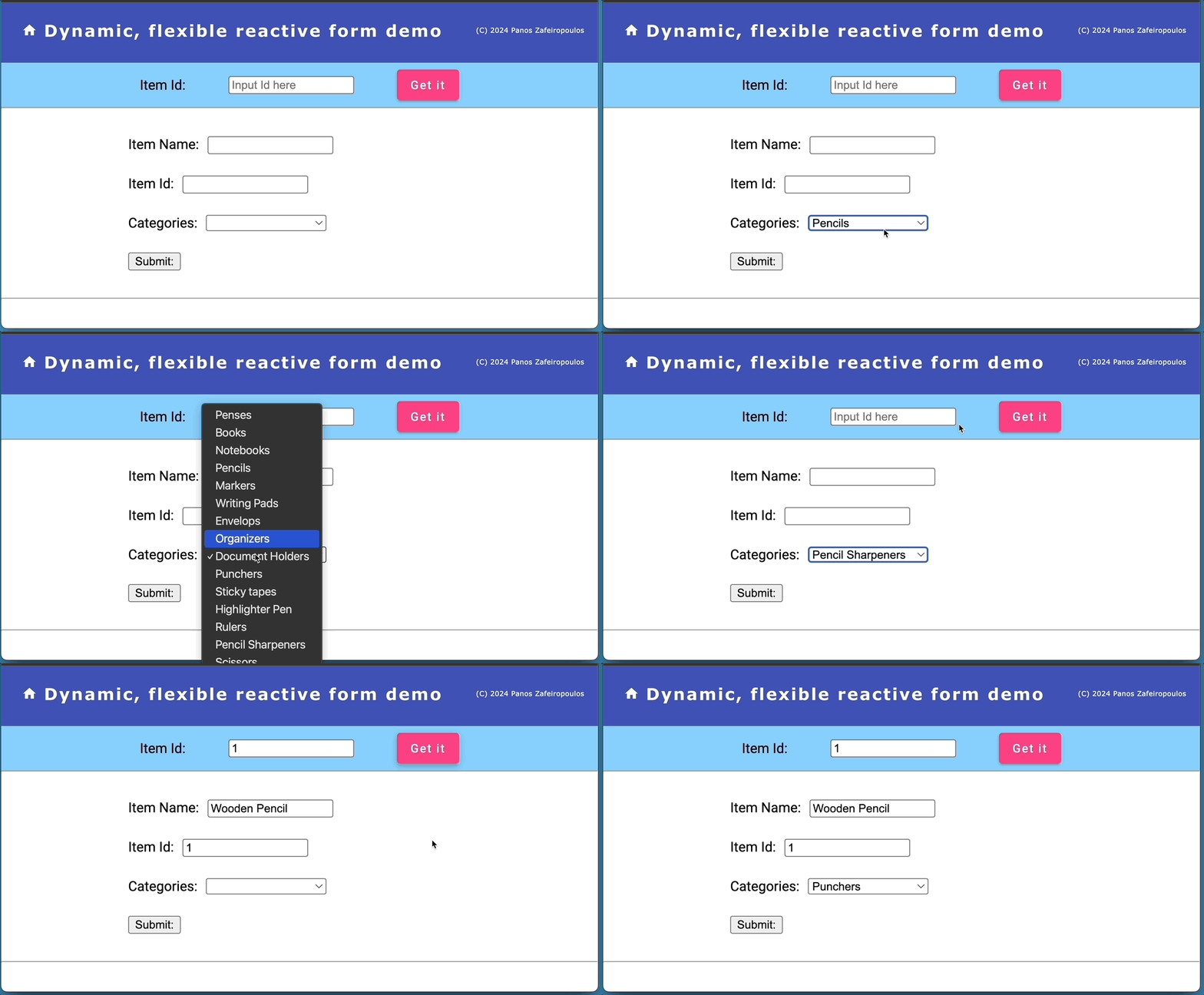
Find the so far code (6th Commit of the repo), here.
Make the Select/Dropdown element multi-select and pre-set any fetched value(s)
One more needed step here is to set any fetched option(s) (categories), as pre-set values to the Dropdown element. This means we have to make the form select/dropdown element to be ‘multi-select’. Initially, this sounds simple and the first thing we have to do is to set the ‘multiple’ attribute:

This seems to work OK:
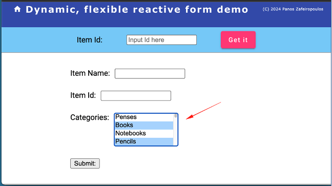
However, there is a tricky point hidden here. If a fetched item has any assigned categories, these should be found in the item property “categoryNames” (see the IItem interface). So, we can iterate through them, and for every match in optionValues, we can set the respective ‘isOptionSelected’ property to ‘true’. We can do so by changing the updateFormFieldsInitialValues() method.
And here is the tricky point. When we apply the multiple attribute, it exists even if it is false, e.g. multiple=false. This causes the reactive form to expect a value for the select control, to be always an array and not a single value, otherwise, no initialValue applies. So, to solve this, the first thing we have to do, is to change the type of the initialValue property to accept also an array, e.g: ‘initialValue?: any | any[];’. Then, the updateFormFieldsInitialValues() method becomes:
Then, the setFormControlValues() method will take care, as before, of assigning the form control values.
A couple of improvements can be made here. Since we do not always use multiple select form elements, we can control the multiple attribute by using one more optional property in the IFormField interface, i.e.: ‘multipleOptions?: boolean;’, and use it in an array of objects (e.g. the ItemsFormFields).
Finally, we can also improve the HTML code to provide some relevant info, as a prompt, to the user for her/his ability to select one or more options. For this purpose, we can add and use another property, e.g.: ‘promptText?: string;’.
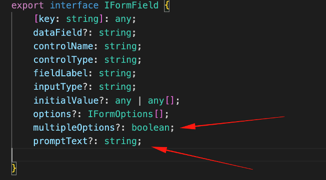
In the ItemsFormFields array:
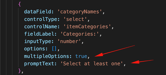
The updated HTML for the ‘select’ element becomes:
. . .
<div *ngSwitchCase="'select'">
    <div class="form-field">
        <label>{{field.fieldLabel}}</label>
        <select [formControlName]="field.controlName" [id]="field.controlName" [multiple]="field['multipleOptions']" >
            <option [ngValue]="null" disabled> {{field['promptText']}} </option>
            <option *ngFor="let opt of field.options" [ngValue]="opt.optionKey">{{opt.optionValue}}</option>
        </select>
    </div>
</div>
. . .
The result is as it is expected:

Find the so far code (7th Commit of the repo), here.
Adding a checkbox
A checkbox belongs to the “input” family, so we can add one field object like this:
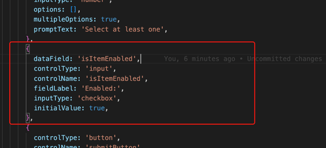
This is quite enough to have the checkbox in place. However, you probably have noticed that we have set its initialValue to true. This is OK when we want a “default” initial value to be reflected in the UI, even without having fetched any data.
To set any “default’ initialValue we have to make a small change in the initializeForm() method, when we add a new control in the form group. So, far, we used to add a new control with no value:
fbGroup.addControl(field.controlName, new FormControl(""));But now we can change it to:
fbGroup.addControl(field.controlName, new FormControl((field.initialValue !== undefined && field.initialValue !== null) ? field.initialValue : ''));Finally, since the checkbox uses the ‘checked’ attribute, we have to add it in the template for the case of an “input’ field. So the
The updated HTML for the ‘input’ element becomes:
. . .
<div *ngSwitchCase="'input'">
    <div class = "form-field">
        <label>{{field.fieldLabel}}</label>
        <input [formControlName]="field.controlName" [id]="field.controlName" [type]="field.inputType" [checked]="field.initialValue === true" >
    </div>
</div>
. . .
And the result is:
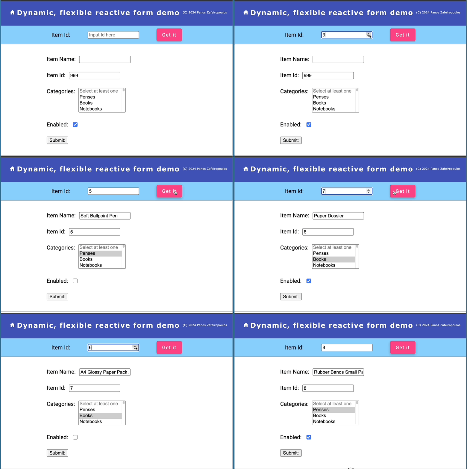
Note that, for demo purposes, I’ve added the so-far missing data-field ‘isItemEnabled’ in both the IItem interface and the data in the /assets/items.json file. Also for demo purposes, I’ve set the 999 as initialValue in the itemId field in the ItemsFormFields array.
Find the 8th Commit of the repo, until this point, here.
Adding a radio-button group
As in the previous checkbox case, a radio-button group also belongs to the “input” family. Thus, we can add one radio field-object like this:
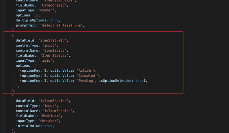
This is OK, however the native HTML code for a radio-button group is a bit special. Actually, each option requires a pair of label-input tags. And, we have also to use the checked attribute for setting the radio button we wish to be checked (as we previously did with the checkbox).
In order to distinguish and render the case of a radio button in the HTML for an ‘input’ element we can use an ngIf – ngIfElse pair in conjunction with the ng-template built-in directive.
So, the HTML template becomes (pay attention to the section for the ‘input’ element ):
Next, some adjustments, are also necessary in the FormComponent class code, and especially in the updateFormFieldsInitialValues() method. Again, this is necessary for setting the pre-selected radio button when an item is fetched.
The updateFormFieldsInitialValues() becomes:
The result:
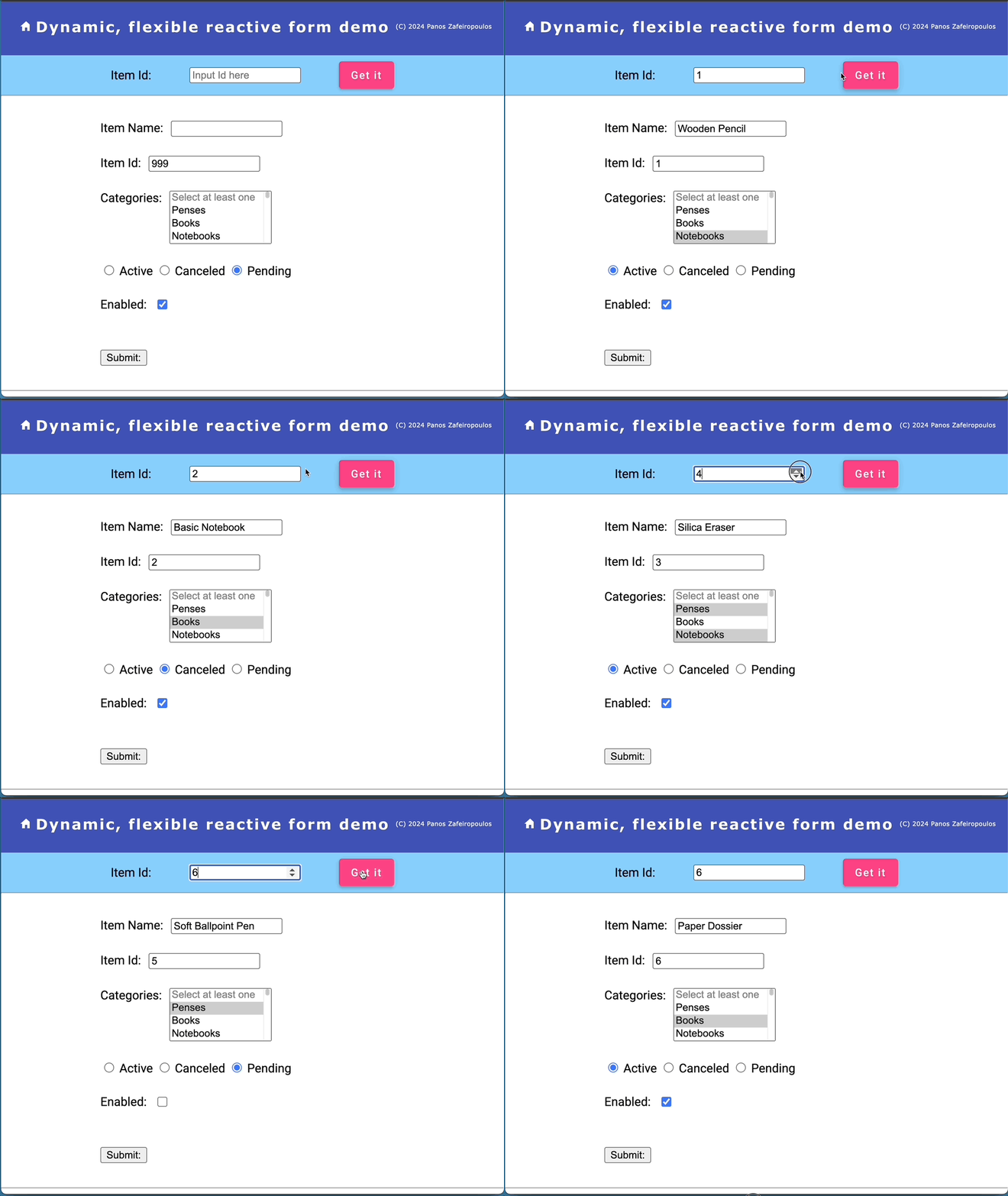
Find the 9th Commit of the repo, here.
Adding a datetimepicker element
The input HTML form-element tag also provides 3 types for using them to get a date, a time, or a date and time value from the UI. Here, we will use one: for the date and the time. This is the “datetime-local” type. So, adding just 1 object in the ItemsFormFields array, like the one below, is quite enough to do the job with a default datetime (datetime-local) picker:
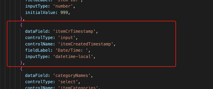
We will use it, for our item’s itemCrTimestamp data field which fetches a date-time stamp value that includes seconds, e.g.: “itemCrTimestamp”: “2024-02-01 07:25:20”. However, the native datetime picker here does not provide a second selection.
This is pretty enough to do the job. No other code adjustments are required! The result is shown below:
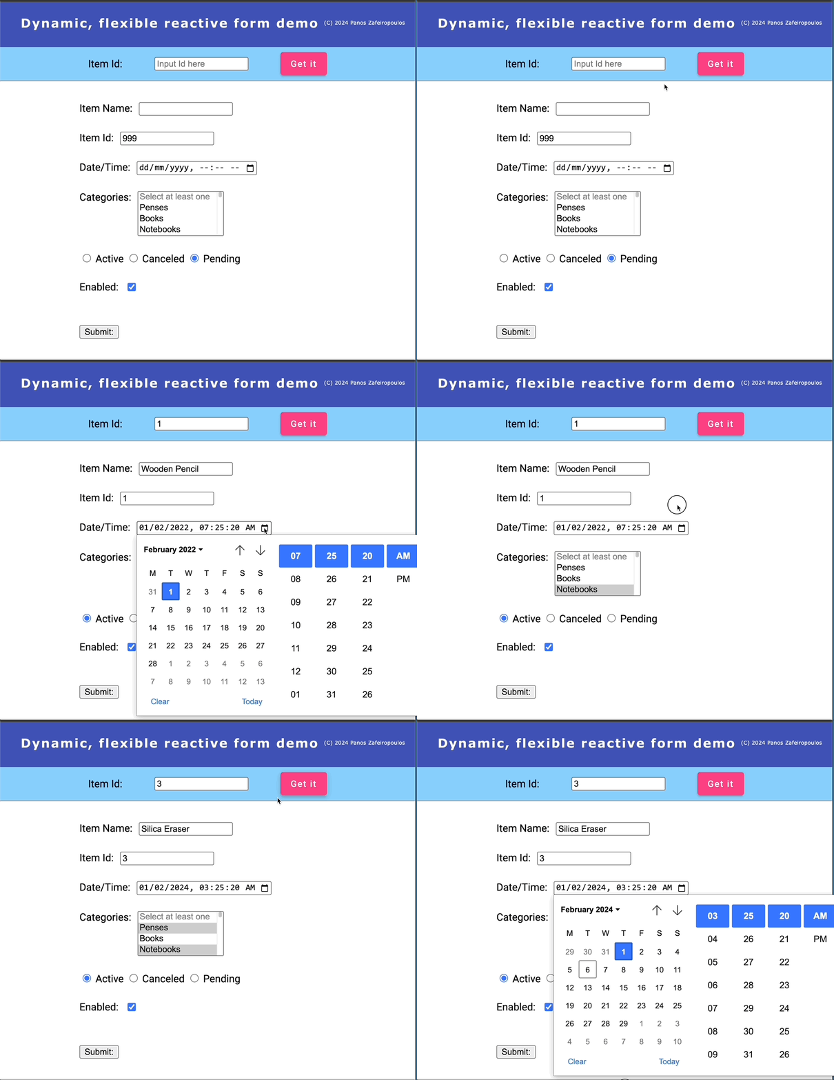
Find the last commit (10th Commit) of the repo, here.
Refactoring!
Concerning… the Separation of Concerns
So far so good. But it’s not that good. We left our code a bit messy to speed up the development process and see tangible results after a feature (e.g.: after a form element/control has been added. What is bad, is the fact that our FormComponent, apart from creating the form controls (which should be its primary and sole duty), also does other domain logic jobs, such as fetching data (i.e.: an item object, and the categories via the DataService), and updating the objects of the formFields array. These are not the jobs for our FormComponent. It should only look after creating the form controls from the formFields array and only be kept updated for any changes to this object’s array. So, doing some refactoring can help our components and services follow the “separation of concerns” principle, in a better manner.
So, let’s see how we have improved our so-far code.
The FormComponent
All the domain logic has been removed from the FormComponent. The FormComponent subscribes only to the DataChangeService – getFormFields observable, for obtaining a formFields array. The DataService, as well as the ItemFomFields constant, become unknown to the FormComponent. Only the interface IFormField is needed. The “updateOptions()” and the “updateFormFieldsInitialValues()” methods have been moved into the DataChangeService. The “itemChangeSubscription” has been renamed to “formFieldsSubscription” (to emphasize that any Form Fields array service can be used.).
The FormComponent (form.component.ts)
The RequestDataComponent
The RequestDataComponent still accesses the DataService, because it has to initialize the Categories array and get an Item whenever we click on the “Get It” button. Then, it updates the DataChangeService accordingly. Categories are needed once, but they are needed early, for setting the initial options array, so the GetDataComponent updates the Categories in its ngOnInit life-cycle hook.
However, we can remove the whole domain logic from it. For this purpose, the RequestDataComponent can deal only with the DataChangeService (now it becomes ItemsFormFieldsService, see below). So the RequestDataComponent accesses the ItemsFormFieldsService, just to send it the itemId, whenever the user changes the Item id value. It does it, via accessing the “setItemId()” method of the ItemsFormFieldsService.
So, we can remove all the related methods, e.g.: “getItem()”, “getCategories()”, “updateItem()”, and updateCategories(), as well as the unsubscribing methods. etc. They are useless now.
Moreover, we can also remove the “Get It” button and thus, the “onFormSubmit()” method. We can do this by subscribing to valueChanges of the FormGroup, inside the ngOnInit lifecycle hook. Then, whenever the user changes the Item id value, the “setItemId()” of the ItemsFormFieldsService, is updated accordingly.
The RequestDataComponent (request-data.component.ts)
The DataChangeService -> ItemsFormFieldsService
The DataChangeService should become the “bridge” between the domain model (e.g.: DataService) and the metadata that describes the business object model (“IFormField”, “ItemFomFields”). So, it has to be used to provide an updated set of metadata. Since it will be used for data concerning the Items, a better name is “ItemsFormFieldsService“.
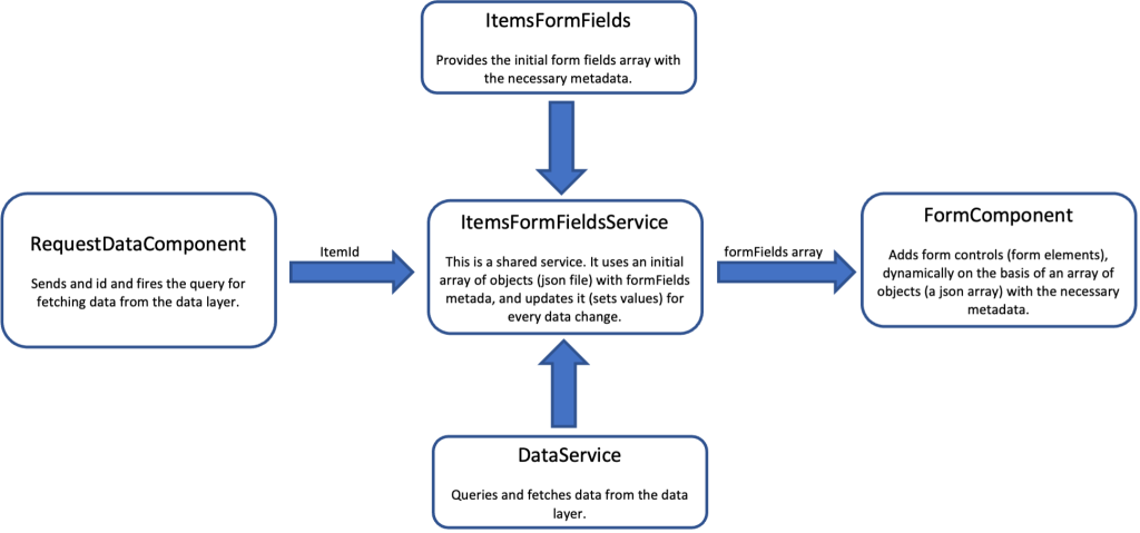
The “updateOptions()” and the “updateFormFieldsInitialValues()” methods have been moved inside it, as private methods, from the FormComponent and they have been split and refactored. Now, the ItemsFormFieldsService uses just 1 BehaviorSubject to provide only the (updated) formFields array. This is actually, the only “contact” point with the FormComponent, which subscribes to it (in its ngOnInit() life-cycle hook method) and it is being kept updated with changes in the formFields array. Thus, the formFields array can be considered, as a dynamic formFields array of objects. Thus, itemIdChange$$ and categories$$ are not used anymore, since they are not exposed as observables in the getItem() and the getCategories() methods. Those methods have been removed as well. Note that renaming has also been done for some other properties/variables and/or methods.
Furthermore, the DataService has been injected into the ItemsFormFieldsService. Thus, the ItemsFormFieldsService becomes solo responsible for dealing with it. The ItemsFormFieldsService uses the injected DataService, to fetch categories just once in its constructor. Then it calls the private “setFormFieldSelectOptions()” method to update the values (options) of the “itemCategories” Select field/element of the formFields array.
As we have said, the new public method “setItemId()”, is accessed by the RequestDataService, each time the Item id is changed. The “setItemId()” method also accesses the DataService to obtain an IItem object, each time the id (itemId) is updated. Then it calls the private (and refactored) “updateFormFieldsInitialValues()” method to update the formFields array.
The ItemsFormFieldsService (items-form-fields.service.ts)
Updates for IFormField interface and ItemFormFields array, and others
For consistency reasons, we have updated the IFormField.ts file. The special/custom type “standardInputType” has been created, for the standard HTML “input” tag, and “type” attribute types. Also, more properties have been added, eg.: readOnly, optionsSize, minValue, maxValue, and stepValue in the IFormField interface.
New objects (fields) have been added to the ItemsFormFields array of metadata objects.: “itemId”, “itemDescription”, and “itemModelYear”. Moreover, other modifications to properties are also done in the ItemsFormFields array to demonstrate how to set the respective attributes using the added properties.
The IFormField interface (IFormField.ts)
The ItemFormFields array (itemFormFields.ts)
The HTML template of the FormComponent has been also changed accordingly.
The HTML template of the FormComponent (form.component.html)
Finally, note that some previously missed updates were also made here and there in the items.json, for demo purposes (e.g.: itemDescription, and itemCrTimestamp). You can find them in the repo’s commit bellow.
The result is the expected one:
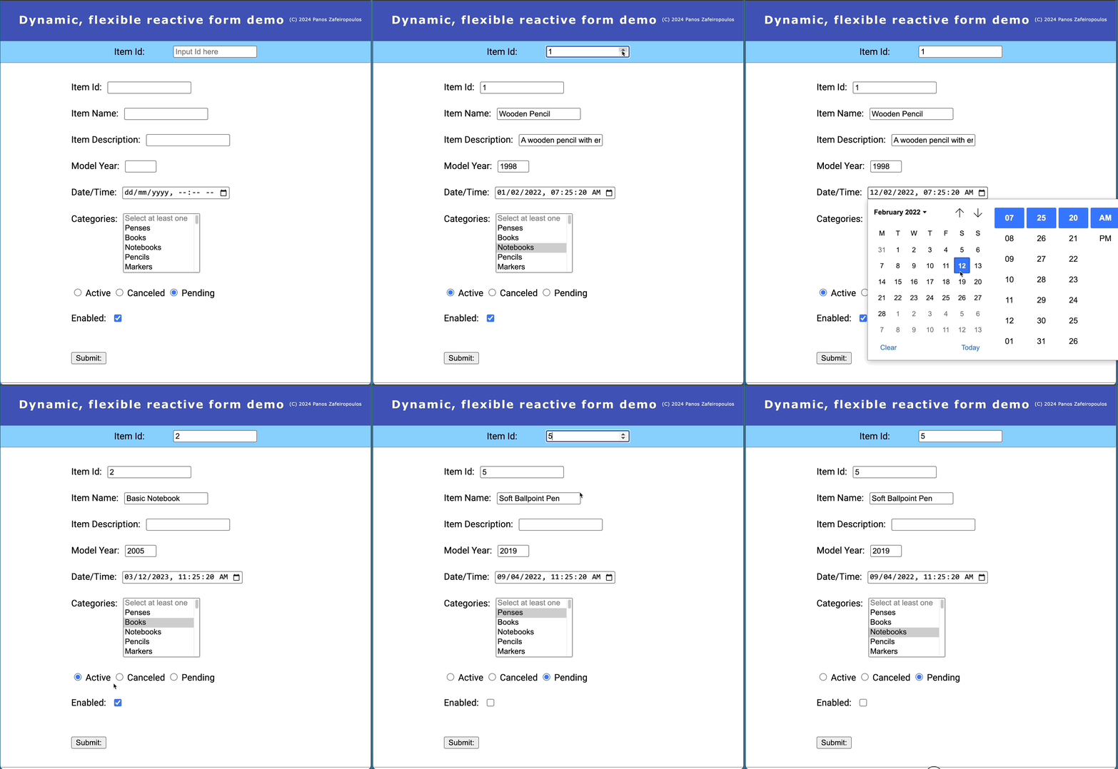
Find the 11th Commit, after refactoring, here.
We are towards the end of this step-by-step guide on how we can build a dynamic form without dynamic components. But before proceeding to see how we can deal with dynamic components we have to take a look at how to add some validators to our form.
Adding validators
If we want to add some validators to our form, we must prepare the necessary metadata for form field validators and then use them for any form field object we wish. As you probably have already guessed, validators can be added as one more property in our IFormField interface. For obvious consistency reasons, we must create an interface for using it as the type of our ‘validators’ property. Below, you can find an implementation of such an interface (the ‘IFormFieldValidator’), that contains just 3 properties (types):
export interface IFormFieldValidator {
  validatorName: string;          // e.g.: 'required', 'minLength', 'maxLength', 'pattern', 'email', 'min', 'max'
  validator: any;                 // e.g.: Validators.required, Validators.minLength(2), Validators.maxLength(10), Validators.pattern('^[a-zA-Z]+$'), Validators.email, Validators.min(1), Validators.max(100)
  validatorErrorMessage: string;  // e.g.: 'This field is required', 'This field must be at least 2 characters long', 'This field must be no more than 10 characters long', 'This field must contain only letters', 'This field must be a valid email address', 'This field must be at least 1', 'This field must be no more than 100'
}
And this is how we added the ‘validators’ optional property in our interface:
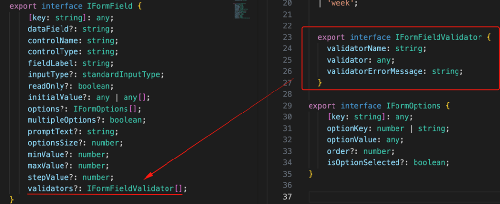
Below we have added a couple of examples in our ItemsFormFields array and how we can use some of the built-in Angular validators, in our case:
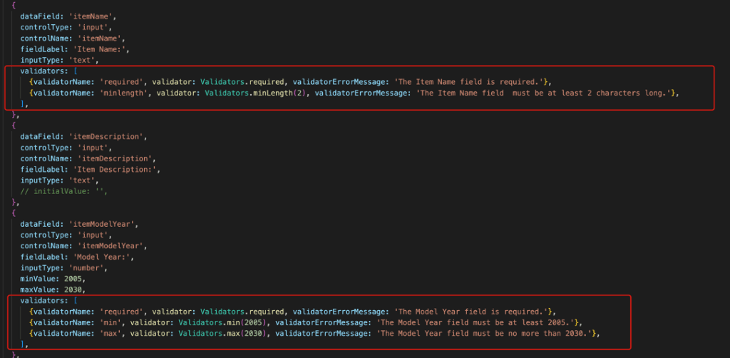
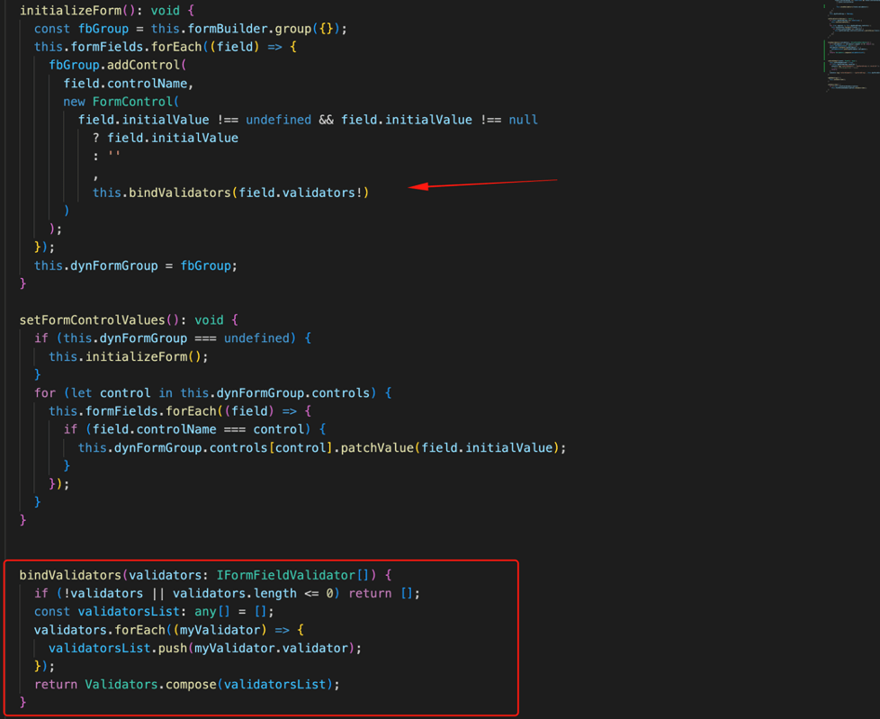
Next, in our FormComponent, we can use a method ‘bindValidators()’ to bind a set of any defined validator in our metadata (in our ItemsFormFields array). We will call this method from the “initializeForm()” method, for every control we add in our form (form group).
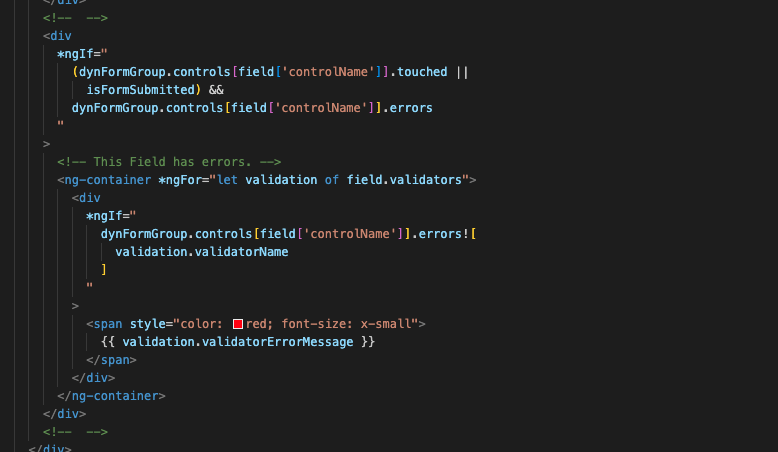
The final step here is to adapt the form template, for applying them in the UI. For this, we can add, at the end of the iteration of the main ngFor loop, a ngIf block to select the appropriate validator for the form element that has errors, e.g.:
That’s it! The result is as it is expected:

Find the 12th Commit, after validators are added, here.
After that, we’ve reached the end of the first part of presenting in a step-by-step manner, how one can implement a dynamic form, based on an array of objects carrying the form field metadata settings.
Some of the key takeaways of this first part are:
- We can establish a data model of objects that can serve the form object model for form-controls creation
- We can iterate through an array of objects (the data model), each one providing the necessary properties, and build a reactive form by adding form controls in a FormGroup.
- We can shape the form HTML code in the form template, by using standard (built-in) Angular structural directives, like ngFor and ngSwitch, for rendering the form-controls provided in the data model.
- Using and leveraging services, rather than sending data between parent-child-related components, keeps our components loosely connected, scalable, and easily maintainable.
This is really an awesome approach; however, this dynamic form does not use any dynamic component. So, now it’s time to go through an alternative, using dynamic components. And most of the approaches we’ve seen so far are also applicable.
BTW. If you want to start digging a bit deeper into Angular dynamic components, it would be quite helpful, to get a glimpse at the official documentation here, or at my post, “Angular: any component 👉 –> dynamic component!” below:
B. Dynamic form with dynamic components
The previous initial approach offers a certain grade of flexibility for building a somewhat “dynamic” form. Here, we will see how we can add a number of separate components, “candidates” for dynamic loading.
The core approaches
- Our form will play the role of a container component for managing the form creation and loading any dynamic components. The form knows nothing about the components.
- A helper directive will be used to apply the dynamic components to the form template.
- A number of independent components will be the candidate components for “on-the-fly” dynamic loading via the helper directive. Each one can be dedicated to a specific kind of HTML standard form element.
- All the components, the helper directive, and the form component (the form container) can be put inside a separate folder and will be supported by just one module, that will expose only the form component to the rest of the app, offering maximum flexibility.
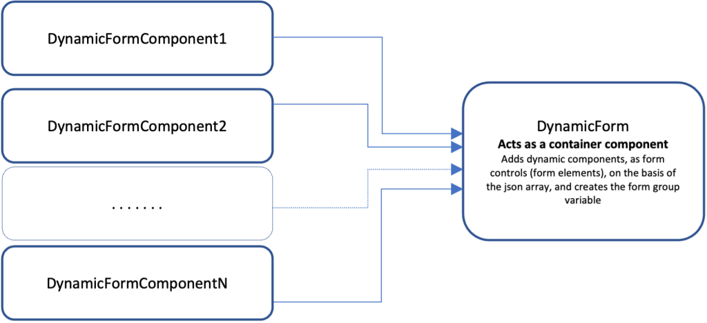
The implementation
For our implementation, we will use the code from the so far commit (12th Commit), here.
First, create a new module file, e.g.: the ‘dynamic-form.module.ts’. The module will be created inside the new sub-folder ‘dynamic-form’ under the /app)
ng g m dynamic-formRemove the FormComponent from the app.module.ts and add it inside the dynamic-form.module.ts, in the declarations array, and also, add it to the exports array. Furthermore, initially, we can add the modules: MaterialModule and ReactiveFormsModule into the imports array.
So, the DynamicFormModule, looks like this:
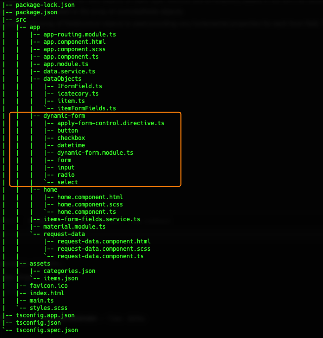
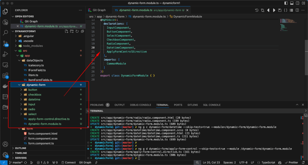
After that, create the following candidate dynamic components into the dynamic-form sub-folder (module):
ng g c dynamic-form/input --skip-tests=true --module=/dynamic-form/dynamic-form.module
ng g c dynamic-form/button --skip-tests=true --module=/dynamic-form/dynamic-form.module
ng g c dynamic-form/select --skip-tests=true --module=/dynamic-form/dynamic-form.module
ng g c dynamic-form/checkbox --skip-tests=true --module=/dynamic-form/dynamic-form.module
ng g c dynamic-form/radio --skip-tests=true --module=/dynamic-form/dynamic-form.module
ng g c dynamic-form/datetime --skip-tests=true --module=/dynamic-form/dynamic-form.module
Finally, create the helper directive
ng g d dynamic-form/apply-form-control --skip-tests=true --module /dynamic-form/dynamic-form.moduleNote: As you probably have already understood, here we are interested in performing any testing, so, we have used the ‘–skip-tests=true’ flag.
After this, you will see that your components have been created into the “dynamic-form” subfolder:
And that they have been also added into the DynamicFormModule:
A bit later, we will start working on changing the FormComponent (the “container”) template, and formulate each independent component template, accordingly. But now, let’s see what will be the role of the helper directive.
The helper directive
If you have previously read my post “Angular: any component 👉⇢ dynamic component!” you should know, that a directive is the real loader of any candidate dynamic component. So, a dynamic component can be loaded by any other component, but in our case using a directive is not only preferable, but it is actually the only logical approach for dynamically loading several candidate components.
The main role of our directive is to use an injected ViewContainerRef instance to dynamically create (instantiate) a candidate component, into the current view container provided by the ViewContainerRef instance. For this purpose, we will use the createComponent method of the ViewContainerRef class.
Any of our dynamic components will be a piece of the view of our dynamic form. This means, that the component, upon its instantiation, has to be informed about the form, in which it belongs, and what metadata are needed, for proper functioning according to its type. So, 2 are the key parameters that are needed to be passed into each instantiated component. The form group instance and the field properties. Both of them are managed in our FormComponent and its template.
To make both of them available to a dynamic component, we first must pass them into our directive. As you probably guessed, we will use our directive inside our FormComponent template, and thus, our directive can access them using 2 respective @Input decorators. Then, the directive passes them to the dynamic component via its ComponentRef instance. We will use both of the parameters passed in the dynamic component into the dynamic component’s template.
One more step for building our directive is to inform it about the candidate dynamic components. This is because the createComponent method requires the type of the component class to be instantiated.
The trick here is to use a key-value pairs (properties) object, where the key will match the controlType property value of our known metadata array of objects ‘ItemsFormFields’ (based on the ‘IFormField’ interface). We can define this object (as const and export it) into the ‘ItemsFormFields.ts’ file.
For increased consistency and to avoid type errors, we can also create the new custom type “dynControlType” into the “IFormFields.ts” file, and change the type for the controlType property in the “IFormFields” interface, from string to “dynControlType”.
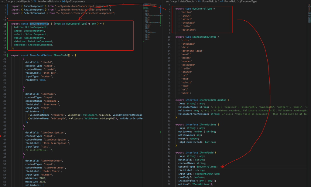
After all that, our directive becomes:
The candidate dynamic components
Now it’s time to work with our candidate dynamic components. First, we must define the 2 component properties for handling the respective 2 key parameters that should be passed into each instantiated component. Both of them are common to all candidate dynamic component classes. For naming them, we can use the same names our directive uses with the @Input decorators, ‘formField’ and ‘formGroup’ but I prefer the field and fGroup respectively. Let’s see this in the InputComponent
One more useful adaptation for a candidate dynamic component is to add our FormComponent’s style sheet. This will allow us to keep using the FormComponent’s style sheet, as a central point for all of the dynamic components being used:
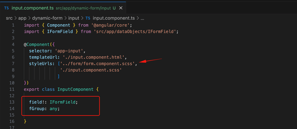
All the above code adjustments are common, and we can apply them to all candidate dynamic components.
After this, we can shape the components template. Most of our initial work here is to copy the respective HTML code from the FormComonent template and paste it into the component’s (e.g.: InputComponent) template.
input.component.html
We can repeat this for SelectComponent and ButtonComponent respectively:
select.component.html
buton.component.html
Finally, the FormComponent template becomes:
form.component.html
The result is pretty much the same as the previous version without using dynamic components:
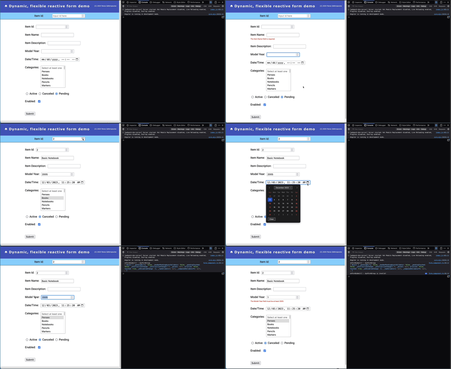
Find the 13th Commit here.
Using all dynamic components
As you probably noticed, so far we’ve used just 3 dynamic components: the InputComponent, the SelectComponent and the ButtonComponent of course. This is because the InputComponent is a “Swish Army knife” component, and so far, it is being also used for covering the datetime, the checkbox and the radio components. But this not that good idea, when we use dynamic components. So, we can adjust those components accordingly.
The datetime.component.html
The radio.component.html
The checkbox.component.html
The input.component.html becomes:
Finally, also note, that in the ItemsFormFields array, the respective field object has been also updated with the appropriate value for their controlType property.
Maybe you are wondering why we use separate components for those belonging to the input family. The reason is that we want to make them independent of each other, and thus a future change will only affect just the respective component. At the same time, this keeps our code easily scalable, and maintainable.
The result remains the same as before. Find, the last committed changes ( 14 Commit) here.
This was the last commit using native HTML elements. Now it’s time to use Material Library.
Using Material UI components
As you might have noticed, our project app had been initiated, even from the very early beginning, with Material UI installed. So, our next step is to beautify our Form and its dynamic components using the Material UI components. The important adjustments made in the form and dynamic components templates.
The form.component.html
The input.component.html
The button.component.html
The checkbox.component.html
The radio.component.html
The select.component.html
Note that apart from the important changes made to the HTM templates and the stylesheet of the FormComponent (form.component.scss file), we imported all the necessary Material Modules into the material.module.ts . Also, we made some side adjustments here & there in our code, (e.g. in “updateRadioOptions” method in the ItemsFormFieldsService, or adding a property in the IFormField/ ItemsFormFields array, the “fornCardTitle” in the FormComponent, etc.).
You can see the result below:
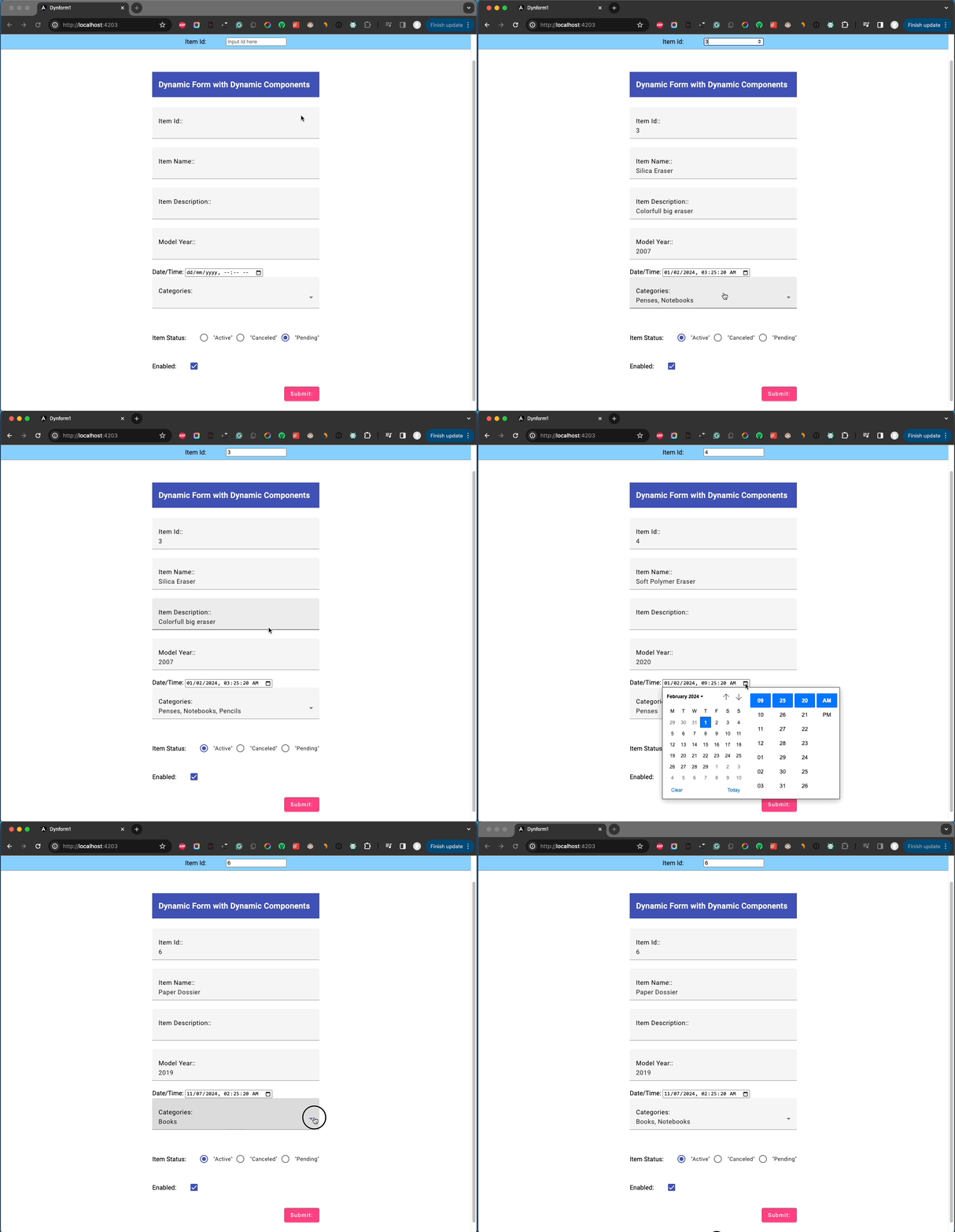
Find the last 15th Commit here.
As you should have noticed we have left out the datetime component. This is because the Angular Material datepicker component does not support by default time picking. The user can select only a date or a date range from the calendar UI –not time. However, there are other 3rd party libraries that can be used to deal with the date-and-time picking.
In the following post of mine, you can read more about the main solutions and challenges for changing the native HTML datetime element to a “Material-compatible” datetimepicker component:
Updating the datetime component
Since one can read the my post I mentioned above, here we quickly implement the @ng-matero/extensions, with the Luxon library, solution. So, run the following commands:
npm install @ng-matero/extensions@16.2.0

npm i @angular/material-luxon-adapter@16.2.13 @ng-matero/extensions-luxon-adapter@16.0.0

npm i --save-dev @types/luxon
After this, the Datetimepicker of the @ng-matero/extensions, and the Luxon datetime library have been added, together with Luxon’s Typescript declarations type file. After this, we must update the material.module.ts file accordingly:
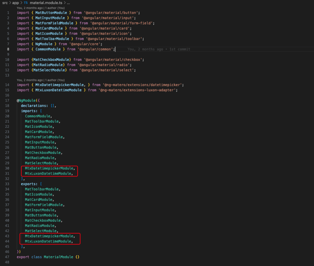
The next step is to theme the ng-matero datetime picker. For this, we can create the following “mtx_theme.scss” theme file:
and import it into the project’s styles.scss file:

After this, we must update the DatetimeComponent and align it to the @ng-matero datetime-picker and the MTX_DATETIME_FORMATS provider, and also update the component template accordingly.
The datetime.component.ts
The datetime.component.html
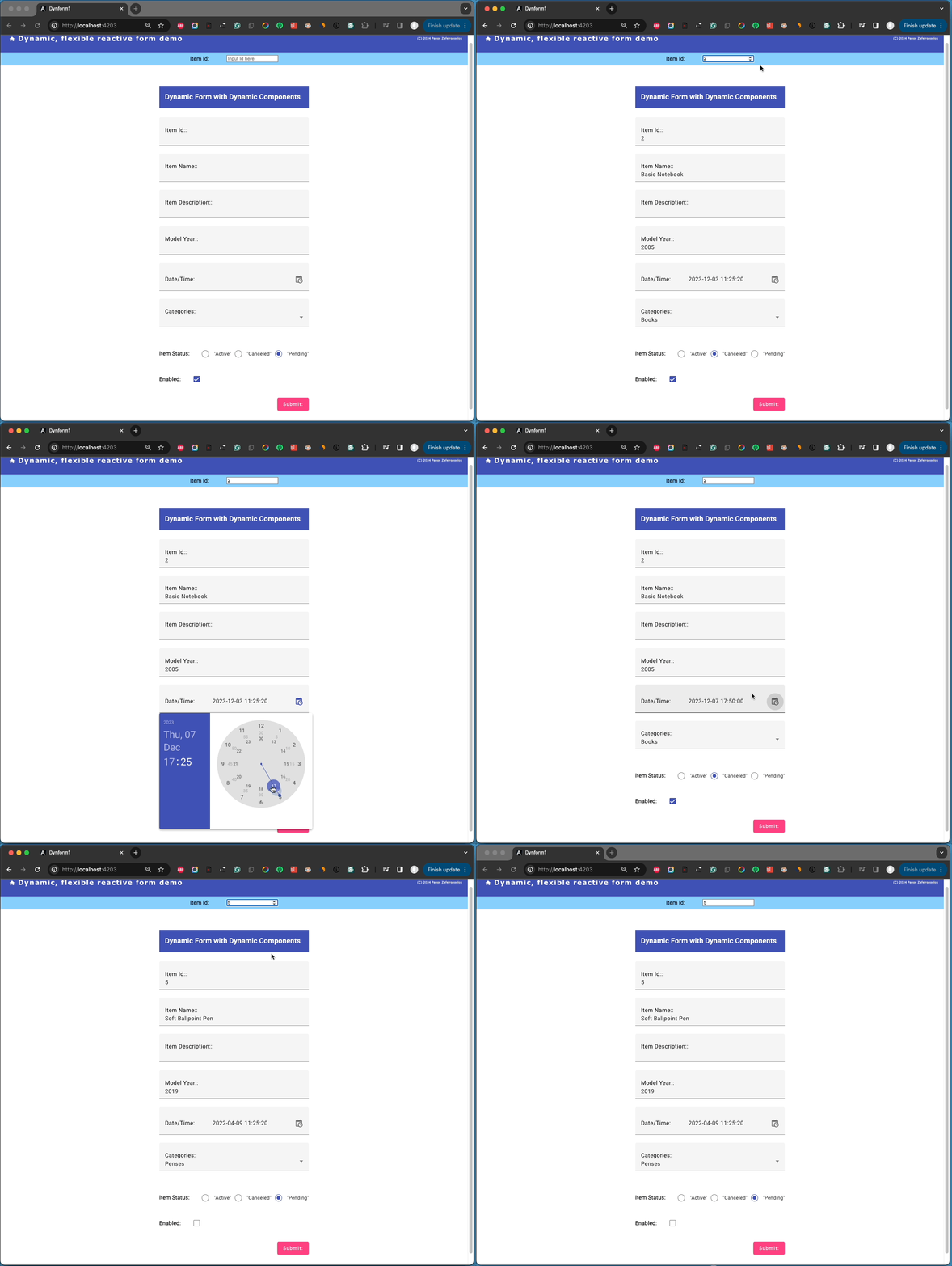
Now we must create/add a method -the “dateTimeString()” method- in the ItemsFormFieldsService to transform the itemCrTimestamp: Date; value to the format supported by the ng-matero datetime picker and Luxon. The method can be called from the “updateFormFieldsInitialValues()” method for datetime controlType components.
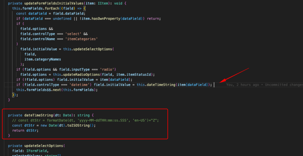
The final step here is to support a passive event listener, avoiding the respective Warning message:

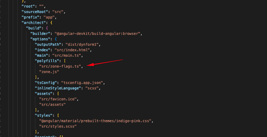
The warning message appears when we first click on the date selection of the datetime picker. For this, we can create for instance, the “zone-flags.ts” file under the /src directory. The file should contain the following line:
(window as any)['__zone_symbol__PASSIVE_EVENTS'] = ['scroll'];Then we must add it into the polyfills section (architecture-> options-> polyfills and before the zone.js) into the angular.json file:
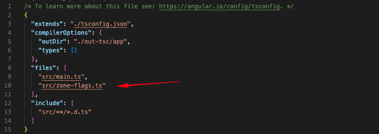
Finally, we must include it in the files section in the tsconfig.app.json file for compilation:
The result is pretty good:
Find the 16th Commit, here., and the final repo’s Commit (17th Commit), after some not-that-significant changes, (renamings, formatting), here.
Conclusions
Wow!, we have done it! Both of the approaches, without or with dynamic components can be implemented. The 1st approach without Dynamic components might be the preferable choice for forms with few elements, while Dynamic components offer much more flexibility, reusability, and maintainability for bigger projects
You should have gained a good grasp of the Angular Dynamic Forms. You can use this post as a reference whenever you start your very own Dynamic Forms implementation. Finally, for Angular 17 and a more sophisticated implementation, don’t forget to look at my related post here.
That’s it for now! I hope you enjoyed it!
Thanks for reading and stay tuned!

